This Netflix movie theatre app concept was done for a graduate school project aimed at creating a new mobile-based service/product for an already existing service. I chose to expand on Netflix's business by proposing a service that could leverage their already existing user data and personalization technology to serve users better recommendations for movies currently in theatres. This application would allow users to make their ticket purchases through Netflix, allow users to be reminded when a film is now airing on Netflix as well as recommend related media available on Netflix. The main purpose of this application in turn, would not be to become successful through theatre ticket purchases, but to succeed through being intertwined with Netflix proper.


The Team
Tools Used
My Role
Javier Guzman (Me!)
Figma
UX Research
Adobe Photoshop
Graphic Design
Adobe XD
Wireframing

Content

01

Background

Why, And What's The Goal?


Why theatres? Why an app? Well, for more data. The goal of such an app would not be to become profitable through ticket purchases for currently airing films, but instead to allow Netflix a new avenue to collect user data to further improve the user experience on the main Netflix service. Netflix would now be able to get a head start on collecting data relating to viewing habits, even eliminating the need for a film to be aired on Netflix at all. Additionally, Netflix is in a unique position where it could tie in many of the features current theatre application include and expand on them through their already existing service. A watch list would now be connected between theatrical releases and on-demand releases. Additionally loyalty rewards would no longer need to be solely tied with theatrical ticket purchases and could instead now also extend to an ongoing Netflix subscription, giving users a higher perceived value and potentially increases user retention over time.

The Challenge: Tie Both Ends Together

As stated before, the main goal with this project was primarily to fold such a service back into the main Netflix ecosystem and leverage user data, trends, and behavior to enhance this new venture to provide a better user experience than competitors. As such, the main challenge with this project was deciding exactly how much of "Netflix" to bring into this new mobile application, and how hard to push users back into Netflix proper.
02

Ideation

Competitive Analysis & Expanding On Competitor Options


The project started off with a competitive analysis of similar mobile applications which are currently available from major theatre chains such as Cinemark and AMC. The goal with this competitive analysis was to collect information on the features normally found on these platforms and features which were lacking or could be introduced because of the Netflix association. Some of the more important features I decided to include in this new app were: A home page with current and upcoming releases, a rewards page alongside a point system, and QR codes for ticket purchases. Additionally, there was a lack of additional information for films, this was a shortcoming that I aimed to remedy with a more comprehensive page for each film, giving users much more information about films they're interested in such as behind the scenes features, related media, reviews, and links to purchase or rent the film (with Netflix links being more visually prominent). These callbacks to Netflix proper were what was going to set apart this app from currently available alternatives. For example, not only was the app going to show information for currently airing films, like all other competitors, but it would also allow users to explore related media, some of which would be present and available on Netflix. Additionally, the rewards page could be designed in a way to maximize user retention and spending. In essence, after spending money buying ticket using the app, users could redeem points for a month of Netflix, keeping them in the same ecosystem for further amounts of time.

03

UX Research

Interviews, Card Sorts & Tree Tests


Interviews with 12 participants lead this phase of the project allowing the creation of a preliminary list of desired and expected features. Additionally, these interviews were used to present participants with some of the more prominent features discovered during the competitive analysis in order to properly assess how important some of these features present in other apps were. Other questions relating to Netflix's perception among participants were also asked and used later on to decide how prominently to display Netflix related branding in the app's design.

An closed card sort was designed with the information collected in the interviews and competitive analysis, where 10 participants were asked to sort various content types and concepts into one of the four pages that was already planned (Home Page, Rewards Page, Film-Specific Page, and Past Purchases ) to better understand where certain content would end up being placed. This step would help more-so in assigning content that did not have parallels in other apps to the already planned pages. For example, where would users expect a review call-to-action to be present? Where would users expect to find links for purchases? These questions and more were answered partially through this card sort. A tree test was conducted after the card sort using Optimal Workshop to further verify the users sorting as well as test some thematic terminology for some headers and navigation links.
04

Wireframing & Prototype

Wireframing

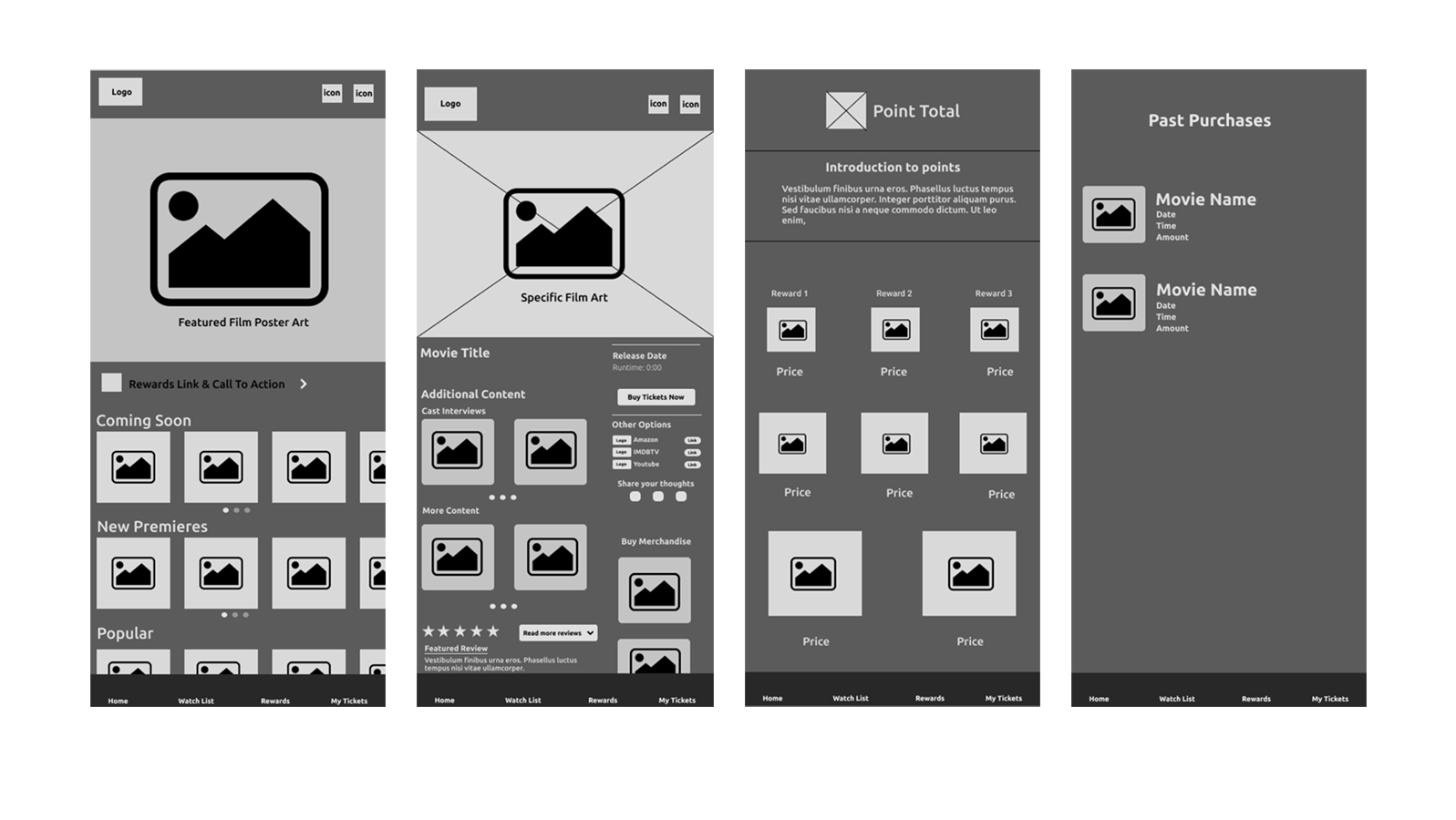
The list of content expected on each page that was created after the ux research phase, as well as the inspirations from the competitive analysis helped expedite the wireframing process. After some quicker, looser wireframes to experiment with element positioning, the wireframes shown below were produced and finalized for prototype creation.

NetflixWireframes

Finishing Touches


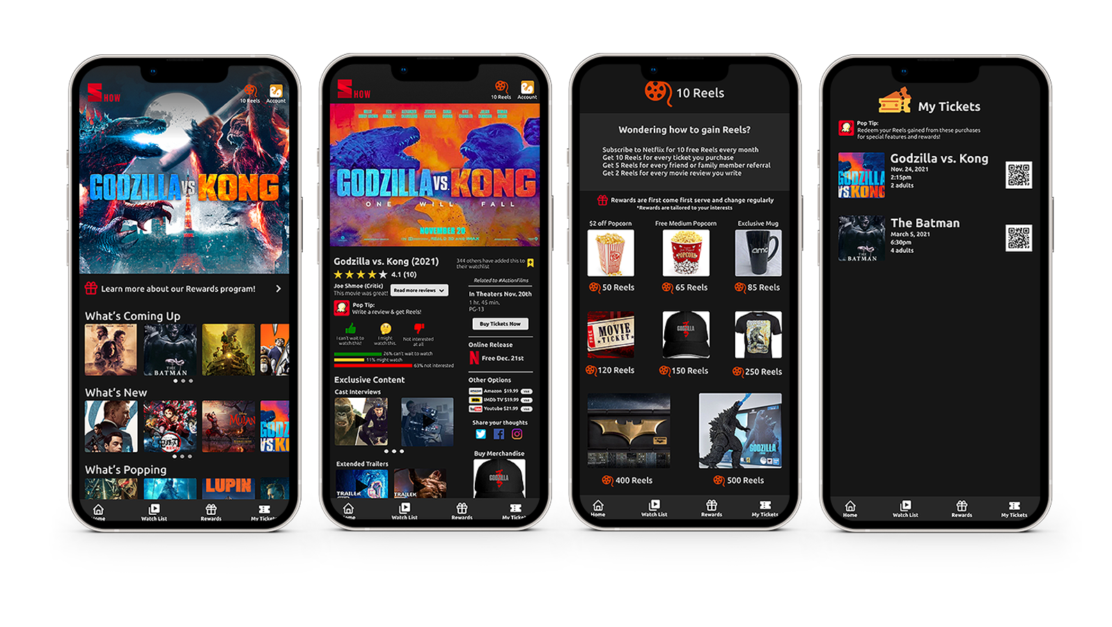
Below are the four main pages created for this project. One of the major changes from the wireframes shown above is the presence of tailored language and terminology to go alongside the theming present in the app. For example, in the wireframes, the third row on the home page is named "Popular", referring to currently popular, or trending films. However, this was changed in the final prototype to "What's Popping", a reference to popcorn. There was a real concern about theming terminology too much, causing it to become confusing to users or, causing it to become off-putting. As such, a "less is more" strategy was taken to make sure the previously listed concerns did not come to fruition.

The other large change took place on the specific film page, where the reviews were moved to the top of the page, where they make more sense for the user. A review-for-points call to action was also introduced both to entice users to leave reviews. This inclusion, while it may seem small at first, causes users to not only interact more with the app, in turn giving Netflix more user preference information, but it also is another source of user retention, keeping users coming back to the app because of the points they are accumulating

NetflixScreens
05

Afterthoughts

Wishful Thinking


It is important to note that many of the topics and ideas discussed in regards to this project are just that, ideas. While I do believe that many of the concepts and related benefits I discussed in relation to a hypothetical official Netflix app would have a chance to be overall positives for the company, they would first rely on Netflix wanting to expand it's business in this direction. There are no concrete numbers in regards to if such an expansion would even be overall beneficial to the company, and as such, these theoretical benefits I discussed might be outweighed by larger negatives relating to this type of expansion. Additionally, because of the scope of this project and the time I was afforded, I was not able to properly test if these ideas are in fact positives at the end of the day.

Where The Project Fell Short


I would be lying if I did not admit that certain pages of the app look better than others. Some pages look more barren, while others look too busy. For example, in the pursuit of giving the user more options, the film-specific page is overflowing with information and content which truthfully would not work well on smaller mobile phone screens. With additional time I'm confident that I could polish every single aspect of the prototype, however I do not currently have any plans to return to this project.