HoloFighter is a conceptual UX/UI focused personal project based on the virtual idol agency "Hololive Productions" that I embarked on after reflecting on my own frustrations with specifically the meter visuals in modern fighting games. The main aim of the project was to effectively redesign one of fighting game's most unchanging UI elements while at the same time exploring an overarching theming in a user interface. I hoped that by introducing a new design for such a long-standing design norm would lead to more innovation which would ultimately result in a better UI for end users of every skill level.


The Team
Tools Used
My Role
Javier Guzman (Me!)
Figma
UX Research
Adobe Photoshop
Graphic Design
Procreate
UX/UI Design
Google Workspace
Discord

Content

01

Background

Breaking Tradition


Despite my love for video games, fighting games in the context of this project, there are still aspects of the genre that I believed were under-explored, and under-innovated. These aspects led to frustrations over visibility, readability, and clarity at a quick glance in contemporary fighting game user interfaces, and specifically meters . My goal coming into this project was to explore potential game user interfaces, taking inspiration from many popular fighting games, while attempting to revitalize the design of meters in these games.

What Are Meters?

Now, I've mentioned the word meters twice so far, but what are meters? Meters, in the context of fighting games are a UI element which keeps track of a limited resource gained throughout a game match. Below are images of different types of meters from the most popular fighting games on the market as of the time of writing this . As you might be able to tell, they are all very similar. A couple might be slightly more fleshed out design-wise, allowing the UI element to fit thematically along with the rest of the UI, but all these meters can still be broken down into a horizontal box UI element which gradually gets filled up to indicate an amount of some resource the player can use.
Examples of meters used in other fighting games

Why Change What Works?


As I previously mentioned, and as hopefully demonstrated through the example images, the designs for meters in these games have been stagnating for decades at this point. While functional to an extent, Managing one's meter can be difficult in the heat of the moment. Game-play where another player is coming for you relentlessly makes it difficult to move your eyes away from the action to check the meter UI. Additionally, meter user interfaces are also often placed in a bottom corner far away from the middle of the screen housing all the action. Fighting games like these already have a high barrier to entry and developers are often looking for ways to not only get new players in the door, but also to retain those new players for long periods of time. Making meters easier and quicker to read, and thus allowing newer players to more easily interact with that meter instead of forgetting about it, would be a step developers could take to lower said barrier of entry.
02

UXR Insights

Understanding The Player Experience


I decided to conduct research to collect information regarding how newer players interacted and kept track of their meter compared to more experienced players. While the inspiration for this project was my won experience playing these games, and my own frustrations with the user interface, I did not want to base all my design decision solely on those personal experiences. I recruited 16 participants to take part in a usability testing exercise that was coupled alongside a short interview. 8 out of the 16 participants were placed in a beginner group which consisted of players who had less than 3 hours of experience playing fighting games of any kind. I did not want to limit the beginner group to completely new players as then they would have no knowledge of game controls or objectives. A three hours max cutoff allowed me to recruit players who had some familiarity with the genre and controls, but did not yet have enough experience to comfortably play the game using all of the resources available. The other 8 participants were placed into an advanced group which consisted of players who had more than 20 hours of experience with any fighting game. This 20 hour minimum would reflect some level of comfort with fighting game mechanics and past experience keeping tracking of the meter user interface in similar games.

These 16 participants were to be observed playing "Street Fighter 5", a popular fighting game that was provided to the participants by me if they did not already own the game. Participants streamed their game play, playing 2 rounds, on Discord so that I could watch remotely in real time. Afterwards all participants were asked some questions relating to their meter usage during their game as well as if they would change anything to make their experience regarding meter better.

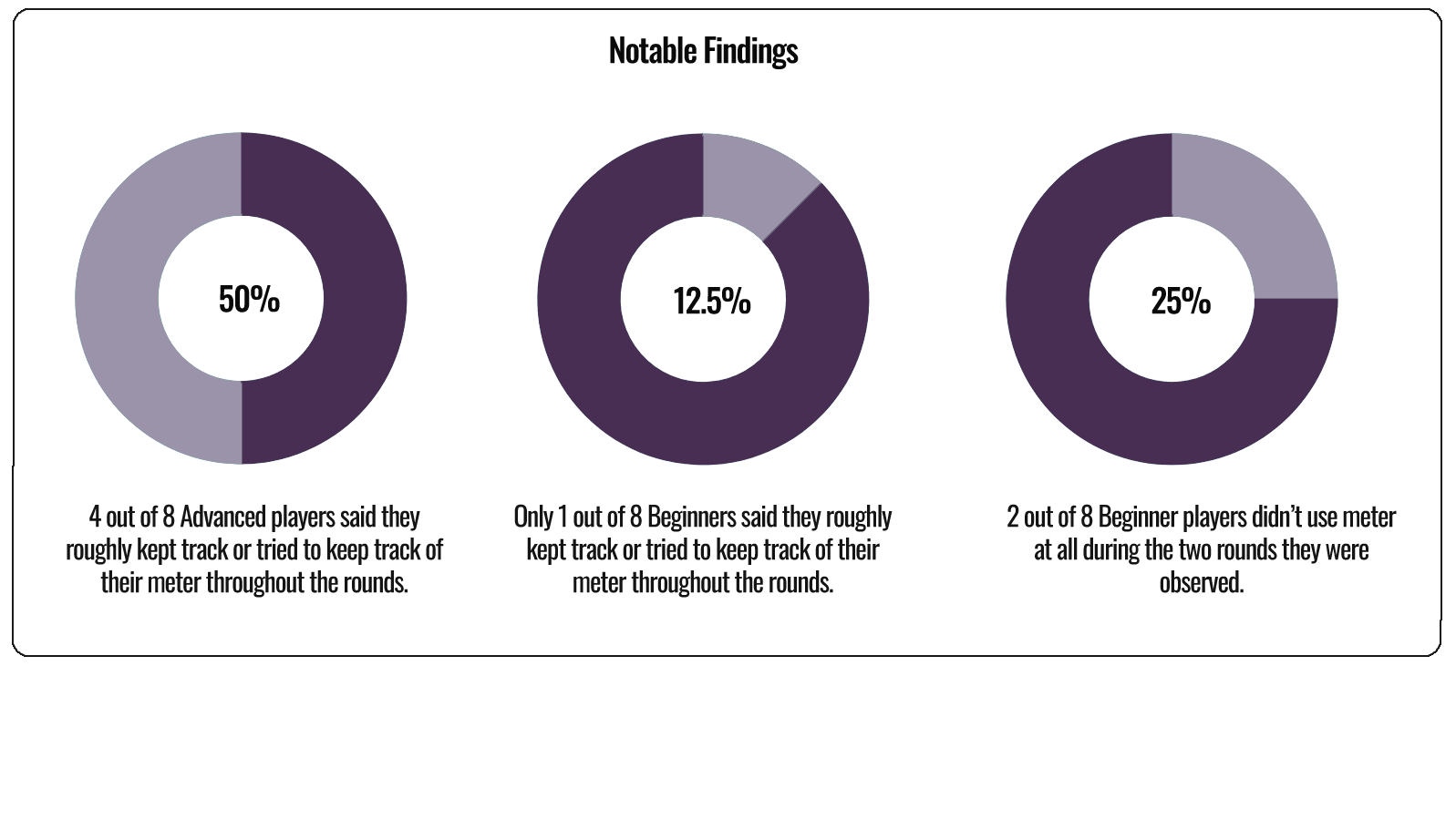
Below are some of my notable findings throughout the research phase as well as some quotes participants provided during the interview process.
visualized findings
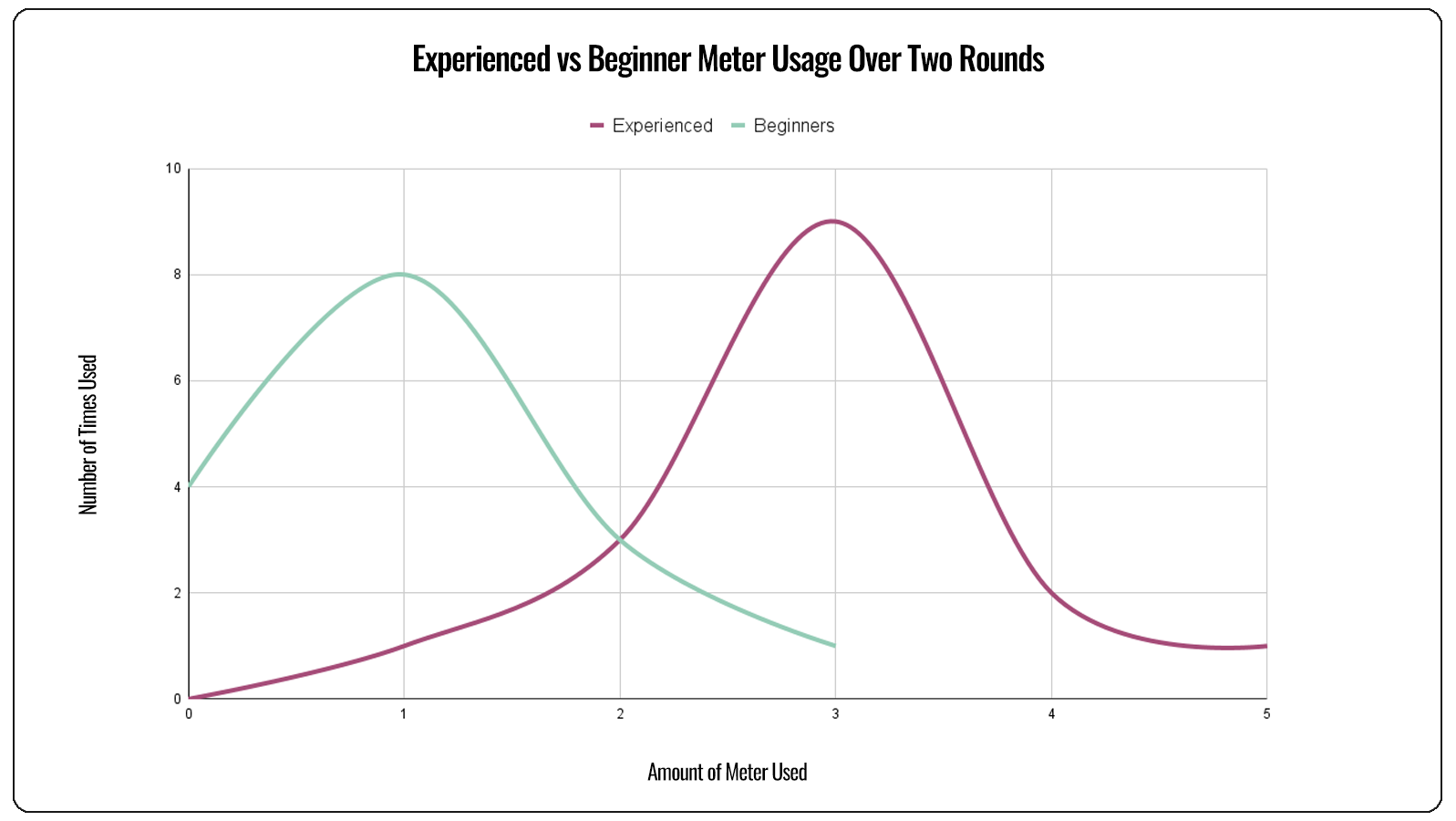
visualized graph comparing experienced and beginner players in meter usage

Differences and Explanations


Above is a graph comparing the meter usage tendencies of my advanced group and beginner group. The overall discovery was that individuals in the beginner group used less meter, and less often, than those in the advanced group. While both axis might seem similar on first glance it is important to remember that these are the combined results for 16 individuals, 8 from each group. For example in the beginner group, throughout the two rounds and between the 8 participants, meter was used only once in a round 8 times. For contrast the advanced group had 9 occasions where meter was used three times in a singular round.

Undoubtedly the graph above shows that there is a definite difference between how beginners and advanced players use meter. The interviews I conducted after the observations allowed me to delve deeper into these differences and explore specifically the beginners line of thinking when it comes to meter usage. Some quotes I collected were:

•"I forget about meter until my opponent uses it sometimes"
•"I can't read it fast enough. I sometimes look at it but don't really know much other than if I have meter or not"
•"I just zone out, I'm just focusing on my character and the opponent the majority of the time"


Ultimately, the results of the observation, as well as these quotes were enough for me to move forward under the assumption that I was not the only individual with these types of problems, and in fact, newer players were more likely to have trouble keeping track of the meter UI, whether because of visibility, readability, or overall clarity at a quick glance. Thus my redesign on the meter UI element would more at this stage focus on making the UI element itself more visually prominent, as well as making it easier for players to keep track of how much meter they had, quicker.
03

Ideation

Inspirations & Expanding the Scope of the Project


The main inspiration for this projects theme was ironed out at this point. Hololive (which is there the "Holo" prefix in the project's name derives from) is a Japanese virtual idol agency primarily focused on youtube livestreams as well as occasional live concerts. They have dozens of popular characters under their agency umbrella, which made them the perfect source material to pull inspiration from for this project. After this point however, I felt the need to expand the scope of the original project. While the focus was still to redesign the meter user interface as discussed previously, I decided to expand the design work to include a full "in-game" user interface to allow the meter redesign to be viewed in the context it would normally be seen, as part of a larger UI, instead of in a void by itself. A character select screen was also created mainly to practice graphic design work as well as explore the idea of more heavily themed user interfaces.

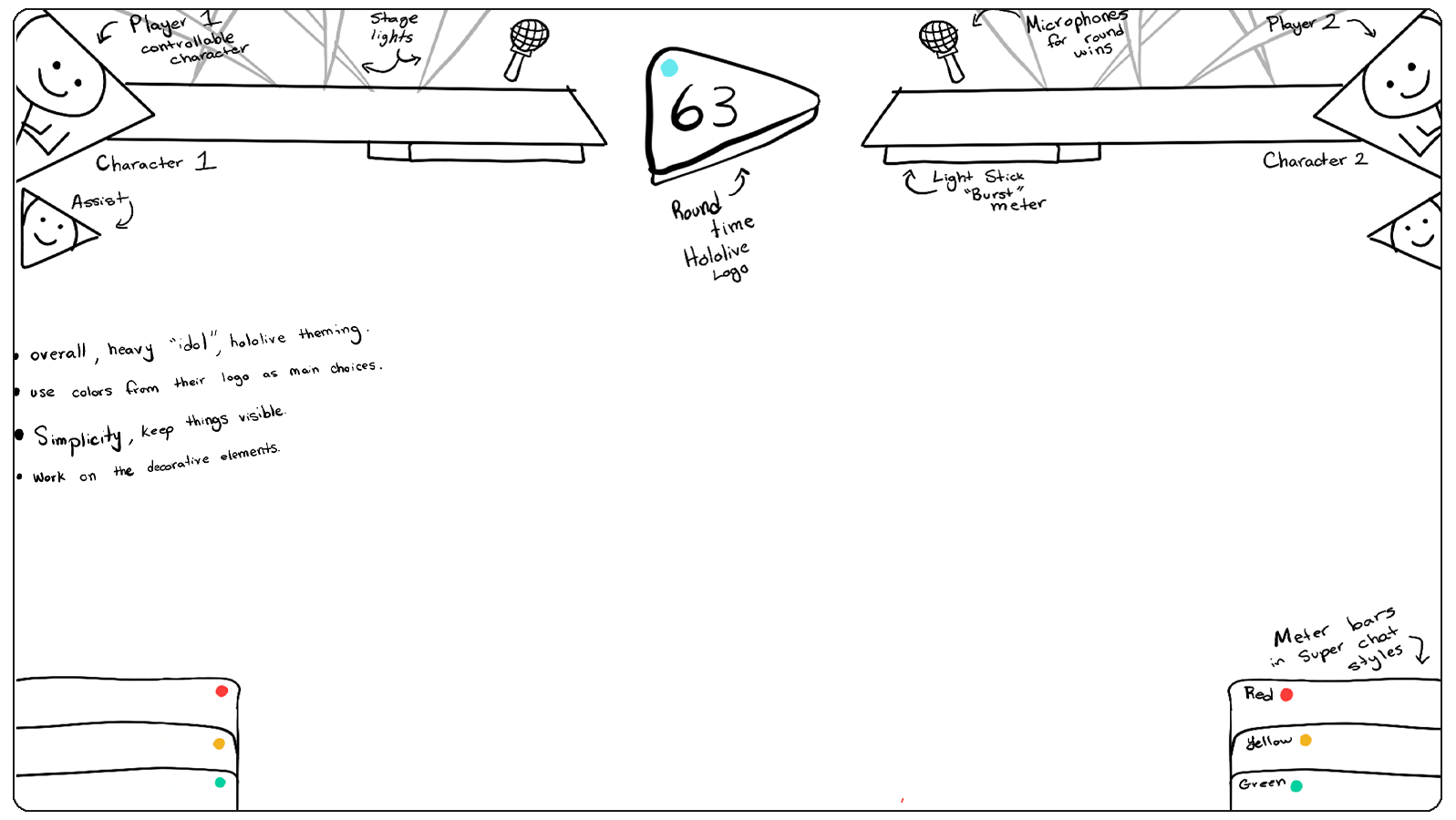
Theme was a very important aspect of this project going forward. I wanted to not only theme the UI as a whole towards the Hololive inspiration I was pulling from, but I most importantly wanted to also theme the meter UI while still striving for my original goal of a more visually prominent redesign which made it easier for players to keep track of their meter. The design I settled mimicked the "Youtube Super Chats" often found in the livestreams of Hololive talents. The red, yellow, and green colors present in this initial redesign not only are common colors used in these Youtube Super Chats, but they're also the three colors present on traffic lights, which allowed me to piggy back on the already existing ingrained responses people have towards these specific colors, especially when they're stacked vertically which also fit thematically with the Super Chat aesthetic. Overall, in regards to the meter user interface, this allusion fit perfectly.

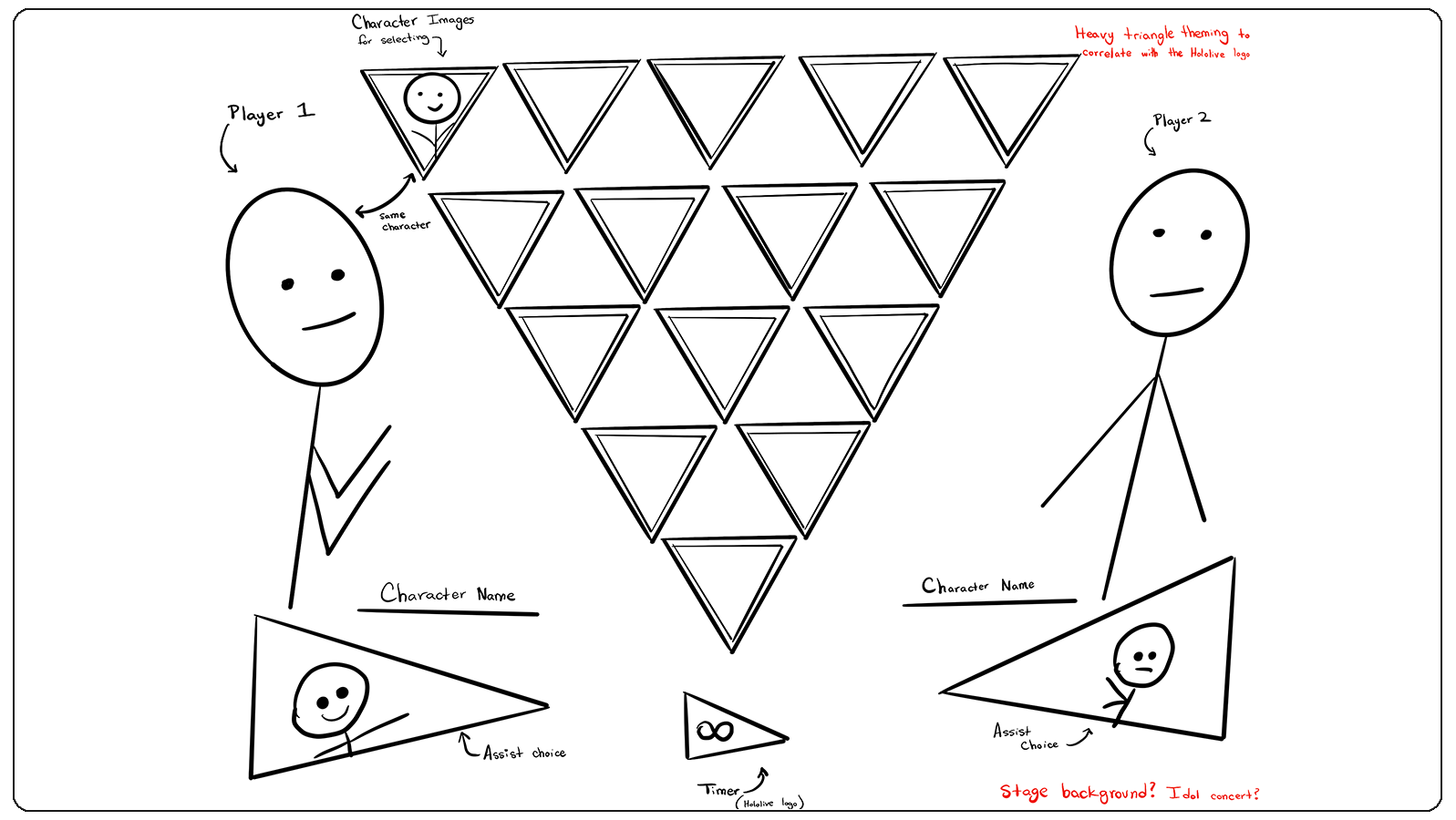
Below you can find some of the initial wireframes and design work I did for these user interfaces, including notations outlining the various themed UI elements referencing the Hololive brand.
Initial wireframe for the UI
Initial wireframe for the character select screen
04

Designing the UI

In-Game UI


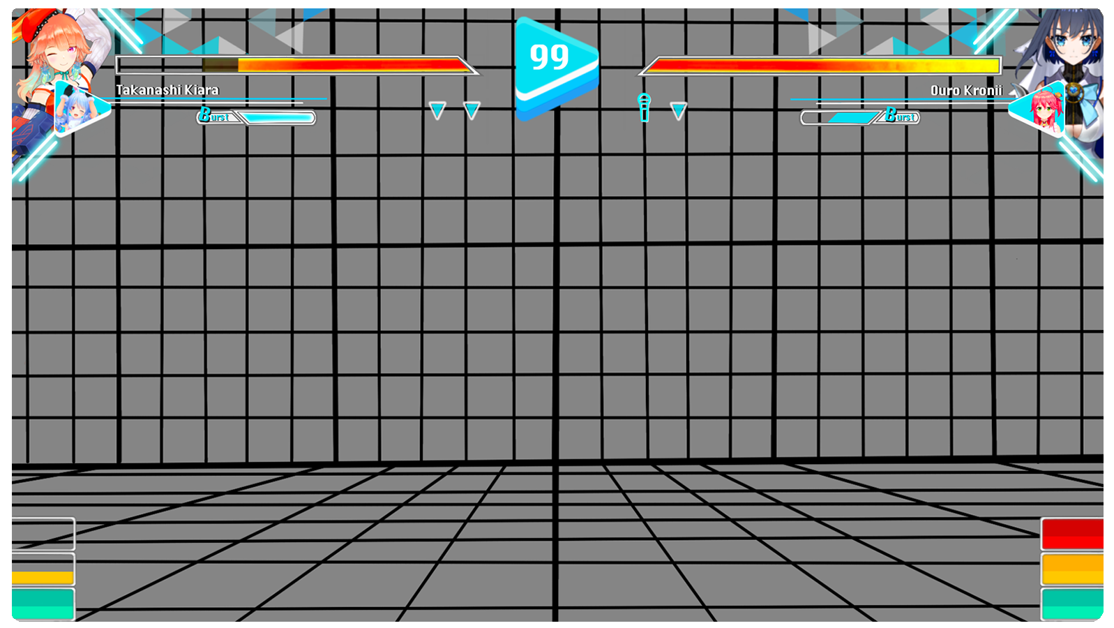
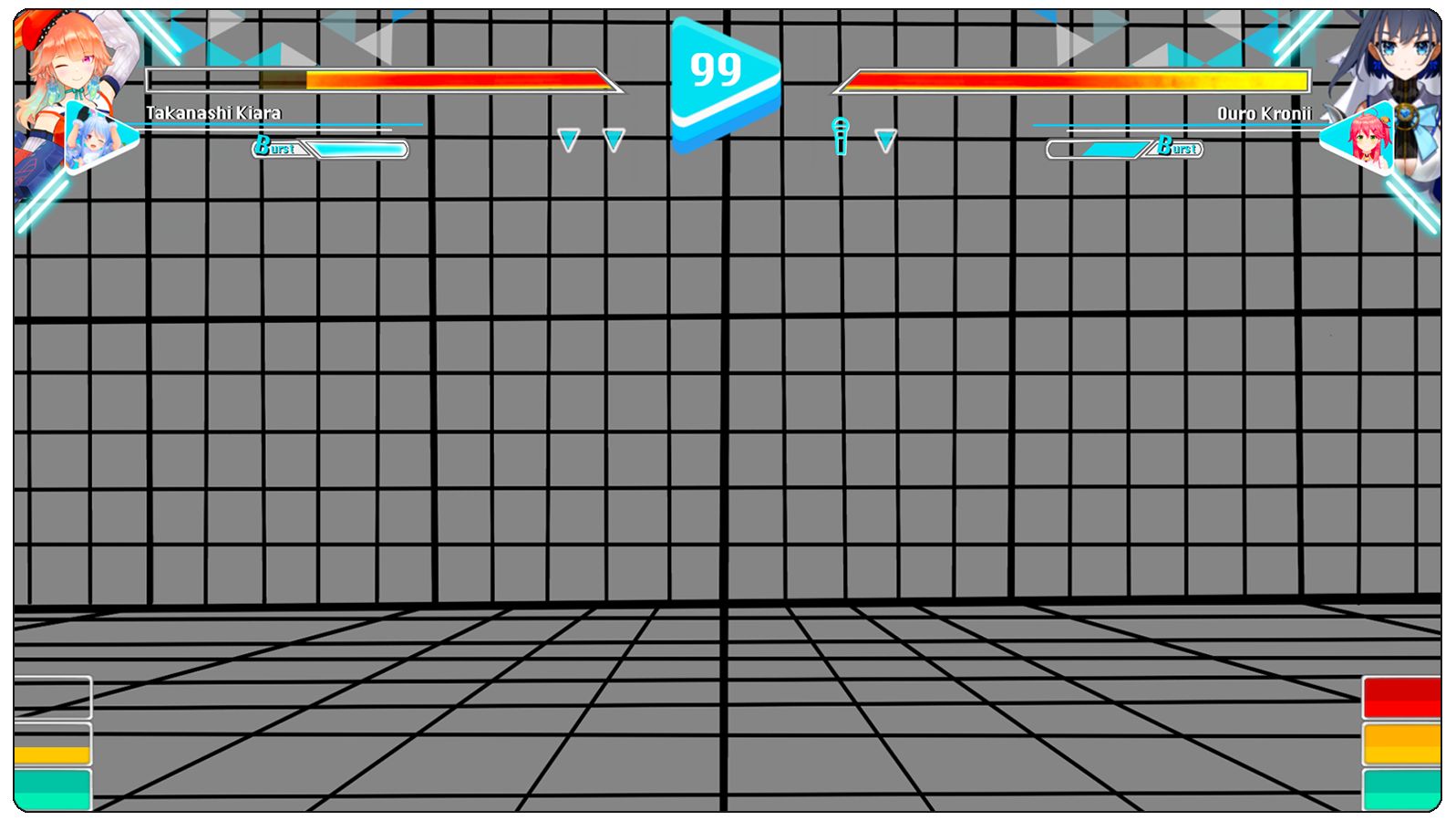
With the wireframes from the Ideation stage, the majority of the work for this next stage was already done, however minor changes were made, primarily for aesthetic reasons. Some of these changes included changing the light beams at the top of the screen to a more uniform mosaic pattern, as well as adjusting the character portraits and the accompanying outlines. For the in-game UI, a background referencing the popular "training stage" seen in many fighting games was used as it was visually simple, allowing it to not distract from the UI itself.

The meter user interface element, present on the bottom corners, are stacked vertically alluding both to the vertical nature of receiving Youtube Super Chats, but also traffic lights as mentioned in the previous section. This vertical design might seem like it takes up more vertical space than traditional meter designs, however there is little to no difference in the vertical screen space required for this change. This was deliberate as I wanted to keep the screen real estate as similar as possible to prevent any possible side effects such as overlapping with the game play happening in the middle of the screen. The two-toned effect, also present in Youtube Super Chats also helps players better understand exactly how much bar they have, acting as a natural halfway mark for viewers. Finally, the colors chosen, as mentioned previously mimic those found on traffic lights, which would potentially be more memorable and allow for quicker reactions as the colors and changes between them would be more internalized and familiar than the solid colors used in most meter user interfaces at the moment. Additionally, the separations present in the meter, both the mid-way color tones as well as the white frames, allows the design to be more color-blind friendly than many in current games.
Final UI image

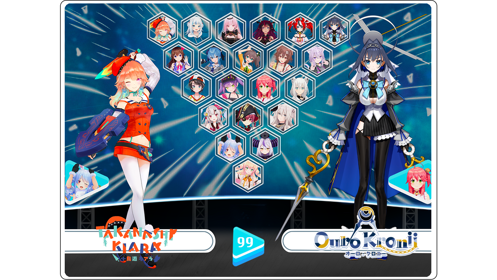
Character Selection


This character selection screen was done as a side project to the main UX work done for the in-game UI as an exploration and practice of theming in video game user interfaces. My main goal with this semi-finalized screen was to take heavy inspiration from Hololive's concerts for it's virtual idols. Everything from the stage floor to the LED screen background were careful crafted and placed in order to invoke the visuals one would see when attending one of their concerts in real life.
Final Character select screen
05

Afterthoughts

Future Work


Unfortunately the lack of time and ability prevented me from going any further with this project. As it stands, my redesigned meter user interface has not been tested and compared to traditional options to get a better grasp on how it performs regarding it's visibility, readability, and overall clarity at a glance. It may very well turn out that my redesign performs worse in all these aspects I was focusing on compared to traditional UI options, however I still believe that I managed to challenge the long-standing design norms within this space. Any return to this project would be with the goal of testing the redesign within a playable prototype to gauge it's value, and I hope to do so someday.