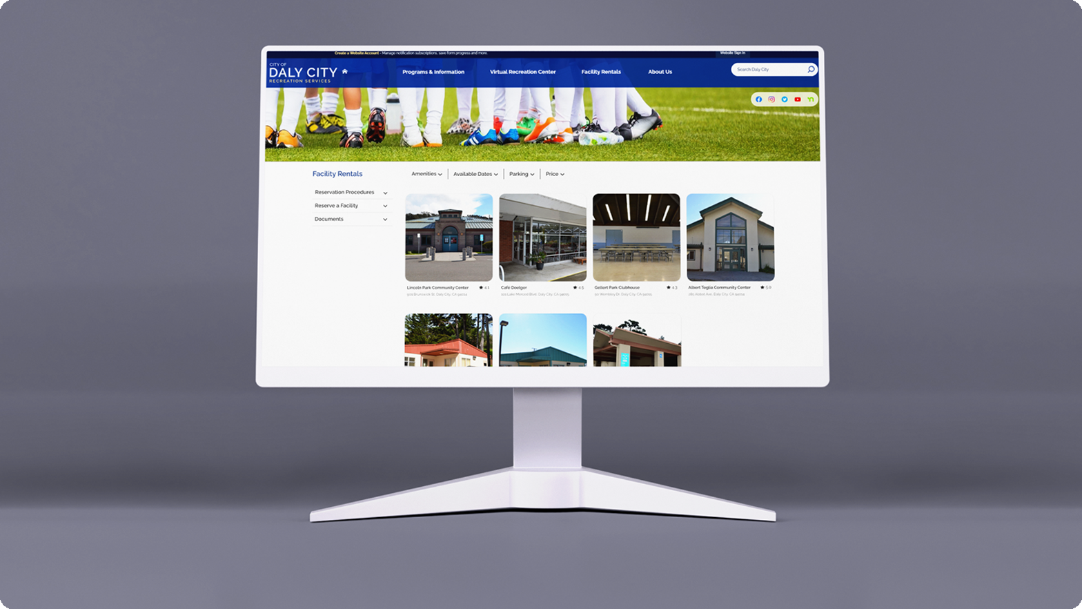
The Daly City facility rentals page is an important resource for those looking for rental spaces for their gatherings or events. However, the current design of the page does not effectively convey the various details that prospective renters want to see when making their choice of facility. This alternative redesign not only modernizes the visuals, but also more effectively presents relevant information to would-be facility renters.

Additionally, the mobile version of the website was also redesigned to mirror the new redesign and its enhanced ease of use.


The Team
Tools Used
My Role
Javier Guzman (Me!)
Figma
UX Research
Adobe Photoshop
Graphic Design
Video Streaming Software
UX/UI Design
Excel
Optimal Workshop

Content

01

Interviews

Insight From Past Renters


The first thing I looked to do was interview past renters and ask them about their experience navigating the website when making their choice. I was able to track down two individuals who had used the website in the past 6 months as their primary resource when looking for a venue. Information that stood out was:
1) The process was generally seen as confusing. Both individuals stated that they had trouble comparing the choices and one stated that they used a google docs to more effectively see the differences between the choices.

2) One individual mentioned that they had no idea that there was a number to call for more information. When asked for further details they stated that they got to the facility page through google (meaning they potentially didn't encounter the “main” facilities rentals page which has overarching information on the rental process).

3) Both individuals stated that they thought the process could have been made easier. They both found the process of going from one option to another generally slow and bothersome with one mentioning that they would have liked the experience to be more streamlined and similar to other renting services like airbnb or hotels.

Existing Issues


Going over the interviews left me with a good idea of the current issues the website had with users and what the main focuses might be going forward in the design process. Additionally, an initial review of the website was done in order to uncover further potential issues.
1) Comparing facilities is bothersome and not easily doable within the website itself.

2) Individuals aren't likely to visit a city's main home page when looking for facility rentals and instead they are more likely to use google. This causes issues with the current design as the main page which provides general renting information is often not interacted with as there is no reason to go back to it once at the individual facility pages.

3) There are better renting experiences out there. The website isn't comparable to contemporary renting experiences, bringing it up to date would make the experience familiar and potentially easier to understand.

4) The general design of the website is not aesthetically pleasing, the large gray sidebar for example is neither necessary nor nice to look at.

5) The facility photo carousel cycles through the images way too fast on initial visit to the page and stops cycling once manual input is made.

6) The fonts used are not consistent between various elements on the page and font colors are not properly contrasting with backgrounds in some elements, causing text to be harder to read than it should be.


Initial Goals


Simply put, my goals with the redesign at this point were to alleviate the issues uncovered while keeping the visuals consistent with the existing website as this is not meant to be a total website redesign. Thus careful consideration must be made to not make the new redesign too visually different from the legacy page designs of the greater website.

02

Task Analysis

Exploring Usability


My first objective was to better understand how users interacted with the current website. Not only would this give me a more concrete idea of what pain points were present in the existing design, but it would also allow me to directly compare this original design to my future rework. I enlisted 6 volunteers remotely observe through Discord and gave them the following scenario and accompanying task to complete.
Scenario
"A family member has asked you for help in finding a local community center for a birthday party. They're looking for a place for around 50 people and a full kitchen (Stove, Oven, Microwave, and Refrigerator) to cook in. They also mention that they want to keep costs to around $60 per hour."

Task:
"Find a suitable facility for your family member's planned birthday party."

Out of the 6 participants, all 6 were able to identify the correct option (Hillside Park Clubhouse). However, 3 were observed to not find the pricing breakdowns. When asked about how they came to their conclusion, those 3 participants remarked that they made an educated guess. Furthermore when these three were informed about the pricing breakdown link, they all commented that they did not think of clicking said link. Additionally the remaining 3 participants which were observed to find, and navigate to the pricing breakdown link did not do so immediately and only did so after a prolonged search of the pages, and multiple visits to the same pages. When asked about this afterwards, they commented that the terminology used in the link was confusing and that they ended up finding the section mainly by chance as they were “just clicking things”

While the task could be done successfully, the process is confusing and has room for improvement in regards to the user experience. Users often circle back to previous visited pages to compare facilities, adding unneeded navigation hurdles and the pricing structure is hard to find as it's behind a document link that does not indicate it includes general pricing information.
03

Exploration

Competitive Analysis


Following the task analysis, to get a better understanding of the paths that could be taken in regards to redesigning the web page, I decided to look at two main categories of website not only as reference material, but to uncover what they do well in regards to their user experience.. First, a real estate website, Zillow, and secondly a short term rental website, which was Airbnb. While not direct competitors, these were websites that performed similar services which could be referenced going forward.

Heuristic Evaluation


A simple, rudimentary heuristic evaluation was done on these two websites (Zillow and Airbnb) to better understand what they did well, and how their design decisions could be used to influence this redesign. Important to note is that one of the initial individuals interviews mentioned Airbnb by name, noting that they would have liked their experience with the Daly City facilities rental to be more akin to their Airbnb experiences.
Recognition Rather over Recall These websites focused on a main “hub” which displayed all available options with an additional filtering system to further reduce unwanted results. These designs minimize the recall required when comparing different venues as well as gives users greater control over the system.

Aesthetic and Minimalist Design: Compared to the Daly City Facility Rental website, Airbnb and Zillow have a much more minimal, streamlined design which results in a more aesthetically pleasing visual experience.

Error Prevention: The filtering system allows users to prevent errors from continued travel between different pages when comparing facilities. Additionally, correcting a filtering mistake is as easy as unchecking a box.

Consistency and Standards: The current website has inconsistent color use, font sizing, and navigation. By following in the footsteps of more commonly used services we can hope that new users can effectively interact with a new redesign without the need to relearn the basics.


As both “competitors” had similar layouts, both with filtering options, I decided that going forward these were two of the aspects I wanted to focus on as they were potentially strong solutions to issues apparent in the original website design.

Personas


After this initial exploration, I created a persona that would serve as a reference based on the interviews and analysis going forward in the design process. As displayed in the persona below, the expected user base is a parent or guardian who might be looking for a venue suitable for their children's birthday party or other family gathering. These users want to stay local to not only reduce travel time headaches, but to hopefully make use of local discounts for facility rentals. Additionally, these users don't want to do any extra work when performing their search, they want their options laid out in front of them so that they can easily compare their choices without any added headaches.
04

Wireframes

Initial Ideas


Initial wireframes were made for the main “hub” page which would act as the primary landing page for visitors looking to rent a facility. Additionally, a wireframe for the specific facility view was also created as it was a necessary and logical path a user might encounter. At this point in time, this specific facility "page" was crafted as an overlay which appeared when an option was clicked on the "hub" page. I also decided to redesign the mobile view in order to keep design consistency between the two and created an additional wireframe for the main “hub” on mobile to share what the redesigned website might look like on mobile devices.
05

Card Sort

What Are Users Expecting


The need for a card sorting session became apparent once the idea for a filtering system was put onto the wireframes. In order to discover what type of information users wanted, and expected from the filtering system, as well as what the headers might be, 5 participants were gathered to perform an open card sort. Participants were provided with topics and concepts collected from a review of the original website which included Kitchen Equipment (Stove, Oven, Microwave, Refrigerator), Included Tables and Chairs, Occupancy Numbers, Parking Information, Pricing, Jumphouse Space, and Nearby Park availability. Additionally, a calendar for available dates was also added to these cards. Participants were then asked to group the cards as they saw fit and give each group a "name" after they were done grouping the cards.
The participants ended up on 3 main groups which I decided to name “Amenities, Parking, and Price” based on the naming schemes provided by the participants.

Participants tended to group Kitchen Equipment, Jumphouse space, Tables and Chairs occupancy together. This group was named Amenities.

Parking was devised, with 2 placing it under what I ended up calling “Amenities” and the other 3 placing it in its own group. I decided to keep it separate and give it it's own group named Parking.

Pricing information, the calendar and the park availability were also not clear cut when it came to their placement. Pricing was placed with the Amenities by one individual while the others kept it separate from other topics. Park availability and the calendar was also kept separate by all participants. The decision was to keep the pricing topic as its own label and fold the park availability into the “Amenities” group in order to save space. The calendar was also given its own filtering label since it required a larger visual footprint.
06

Prototyping

Wireframe Revision


With the newly decided filtering options, a new wireframe was made not only including these new labels, but also displaying how the filtering options would look going forward. Additional visual changes were made from the initial wireframe as well, including streamlining the colors used, and a simplification of the sidebar and filtering menu to incorporate them into the greater design in a cleaner manner.

Style Guide


Now that I was getting into the design work and fleshing out the wireframes, I created a style guide to reference going forward in the process. As stated before, staying consistent with the website as a whole was a main objective, and thus the style not only aimed to fit with the existing design, but improve on it through clearer font sizing, colors, and contrast between elements. No more large gray box that served as a makeshift sidebar.

Final Prototype


Below you can see a short video of the finalized web view prototype. The video goes through the various pages users would encounter during the task analysis performed at the beginning with the original website as well as with this new redesign as detailed in the next section below. The video specifically goes through the main "hub" page, and the expanded view page for specific facilities. In the video you can also see the various intractable elements such as the side bar and the various working filtering functions.
07

User Testing

Comparison


To end off, user testing was performed again in order to determine if there was any improvement on the usability of the design work. Sixparticipants were selected to participate in the same task analysis that was conducted earlier in the design process. They were given the same scenario and task to complete as in the first round. After the task was complete, participants were given a Likert scale survey to assess the ease of use of the website redesign. The scale ranged from "Very difficult to use" to "Very easy to use"
Scenario
"A family member has asked you for help in finding a local community center for a birthday party. They're looking for a place for around 50 people and a full kitchen (Stove, Oven, Microwave, and Refrigerator) to cook in. They also mention that they want to keep costs to around $60 per hour."

Task:
"Find a suitable facility for your family member's planned birthday party."

Results

Participants were not only quickly attracted to the filtering feature, but also seemed comfortable with using it.

When looking back towards the initial issues discovered, the confusion that came with comparing options was reduced with by introducing the filtering system, and the annoyances that came along with continuously switching between pages was seemingly solved by having a main “hub” page. Participants did not backtrack often, if at all, compared to during the original test during this session.

The issue one individual mentioned of not knowing there was a phone number they could call was solved by folding the original “main page” into the new “Hub” page as a sidebar that could be expanded to display that information. All six participants ended up interacting with the new sidebar which housed this information.

Finally, as a potential result of referencing other popular websites with similar functions, like Airbnb, we updated the experience to make it potentially more familiar and easy to use. This is seen by the participants responses to the short Likert scale survey question after the task was complete which resulted 5 participants rating the design "Very easy to use" and the final participant rating it "Easy to use"
07

Afterthoughts

Conclusions & Future Work


Whilst the redesign's usability is not 100% confirmed to be improved, at the very least the redesign accomplished one of it's goals to provide a better visual experience compared to the original website. Additionally, I believe the project as a whole accomplished what it set out to do, as it was mainly created to be a proposal of sorts to put forth the idea of a redesign. The issues associate with the current website were noted, and potential solutions in the form of design choices were presented in easily digestible ways.

If this project was picked up for further work / implementation, the work done here would be kept as a reference for more detailed, in depth work done to determine more accurately the needs and wants users preferably through user testing with a larger amount of participants. A more interactive, fleshed out prototype would also be created for insights beyond the work done in this project using metrics such as task success, page views, abandonment rate, and general usability.