2021-2023
Love Smiles
Creation and expansion of a non-profit organization's web presence
2021-2023
Creation and expansion of a non-profit organization's web presence
Love Smiles is an Illinois-based non-profit focusing on pediatric cancer awareness and support.
This design started as a three-month graduate school project aimed at assisting local organizations with their design-related needs.
After the initial project, I continued working with the founder to rework sections of the website, promote publisher and author partners, and implement the online store, which has helped send over 150 gifts to children battling cancer.
Love Smiles is an Illinois-based 501(c)(3) non-profit organization dedicated to bringing awareness to pediatric cancer that works with childrens
authors to provide special moments for children and their families fighting pediatric cancer.
The founder hoped to provide stories to children and parents to hopefully give them peaceful, normal moments amidst the endless appointments and procedures that she and her daughter had also gone through.
Love Smiles came to us with a request for a landing page to bring people to their mobile app. Despite the limited time-frame we had to work with, our team decided to expand the scope of the project to include a full website after
initial reviews of the mobile app which raised worries over it's usability and user experience.
With a limited amount of time, which was originally meant to be used solely for a landing page, we were up against the clock. Additionally, even before initially scoping out the size of the project, we knew we were going to have to meet the needs of multiple different groups with this design while leaving room for future growth.
We knew after an initial review that we needed to provide Love Smiles more than just a landing page. Their existing mobile application had issues, and Love Smiles at this point was extremely limited in their online presence.
The organization's information was hidden behind by either a Facebook account or a sub-par mobile app they had to download, which resulted in multiple users in the past asking the founder if they had a website they could use instead.
Our goal with the website was to provide solutions for these problems while also providing a platform that potential business partners would be more likely to work with. We wanted the new Love Smiles website
to be where users are sent to first, where the main content was housed, and most importantly completely replace the existing app with a functional mobile web version as well.
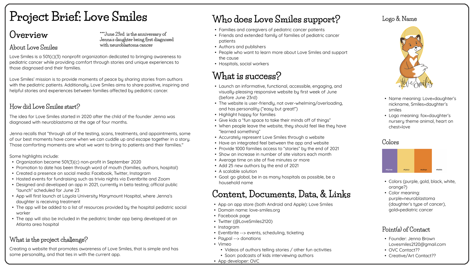
The first thing we wanted to do was create a project brief to lay a strong foundation and road for a streamlined design process in the short amount of time we had available. In this project brief we included all of the information we collected during our discovery phase through interviewing the founder and compartmented them into easy to digest points and ideas that we could reference going forward. This project brief was also used as a presentation piece to show the Love Smiles board that we understood their current issues and needs and give them confidence in our ability to produce exactly what they needed.
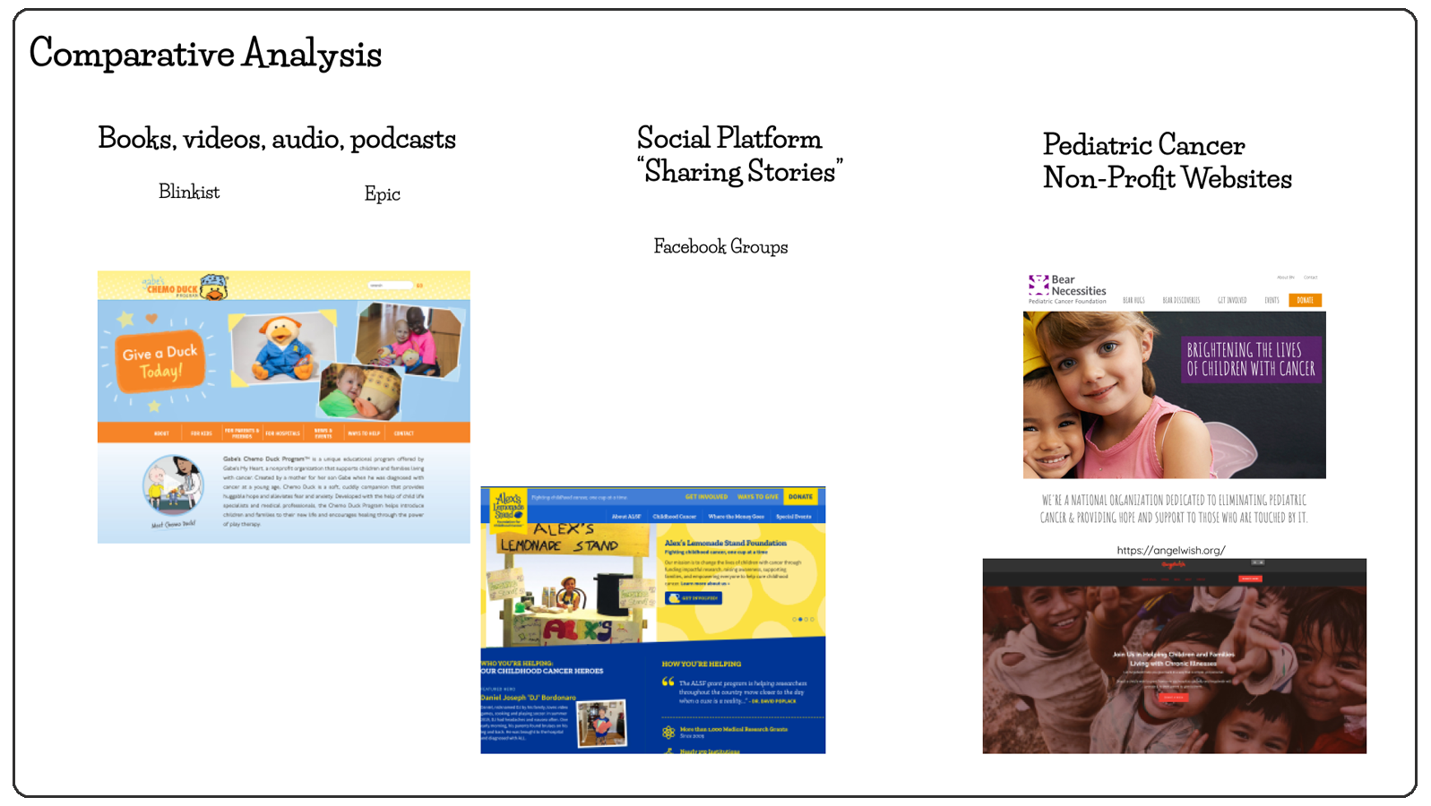
We took a look at dozens of examples of similar website and organizations, and ultimately narrowed down our focus to four organizations who we thought were the most similar to Love Smiles. We used these websites, alongside the information we gathered from the founder, to assist us in creative a rough list of features that we felt were required for such a website and color coded them so that we could focus on those which felt were more important.
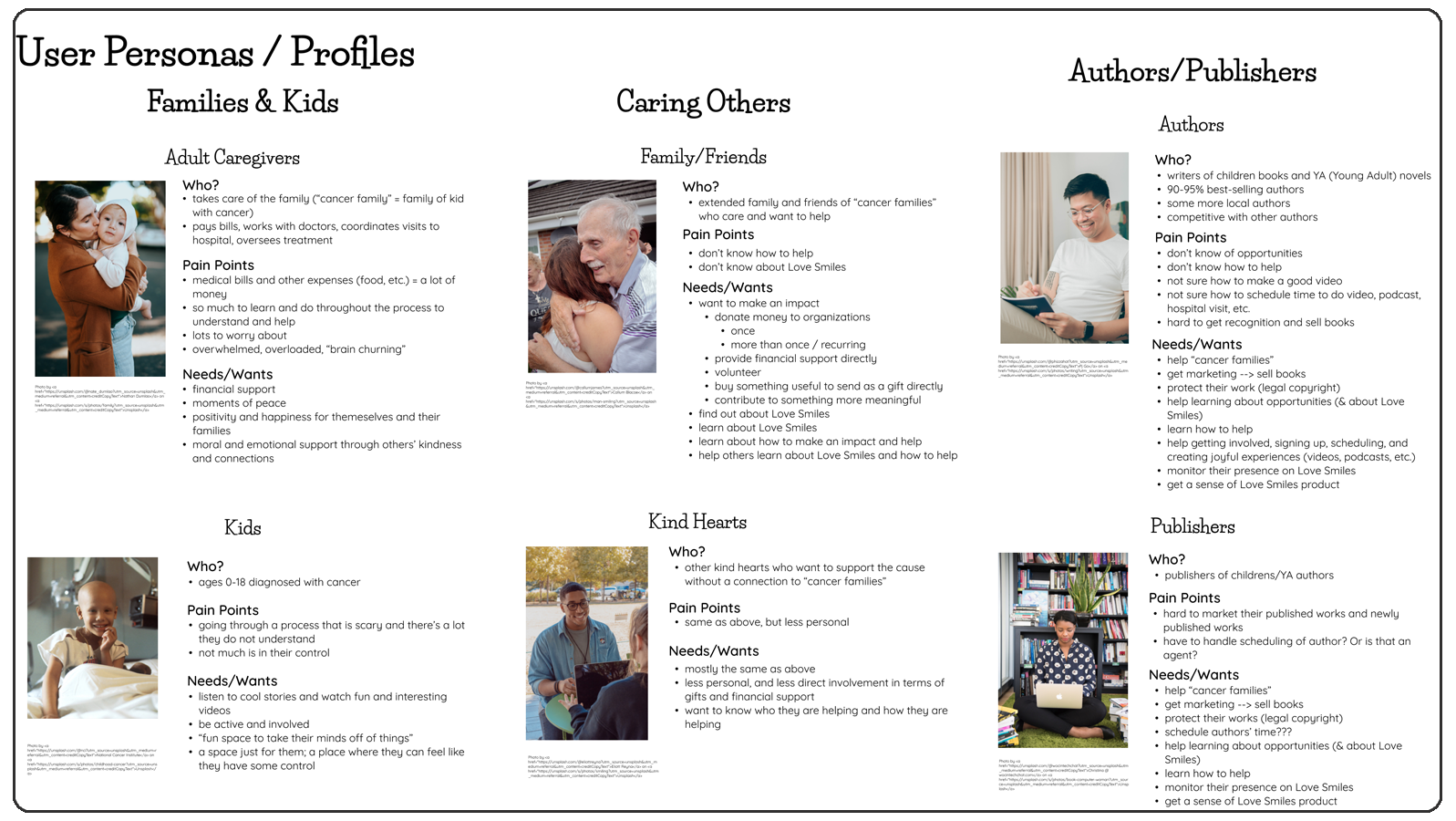
From our initial conversation with Jenna, the founder of Love Smiles, we had a good idea of who our users were going to be as she had gone through a similar journey with her own daughter and thus understood the different types of people at every step of the recovery process. Using that information we created the following personas/profiles to allow us to get a better understanding of each different type of potential user and their specific needs. For example, the needs of a publisher or author will not directly overlap with the needs of a caregiver or child, and yet we have to include both of their needs into the website in a coherent way.
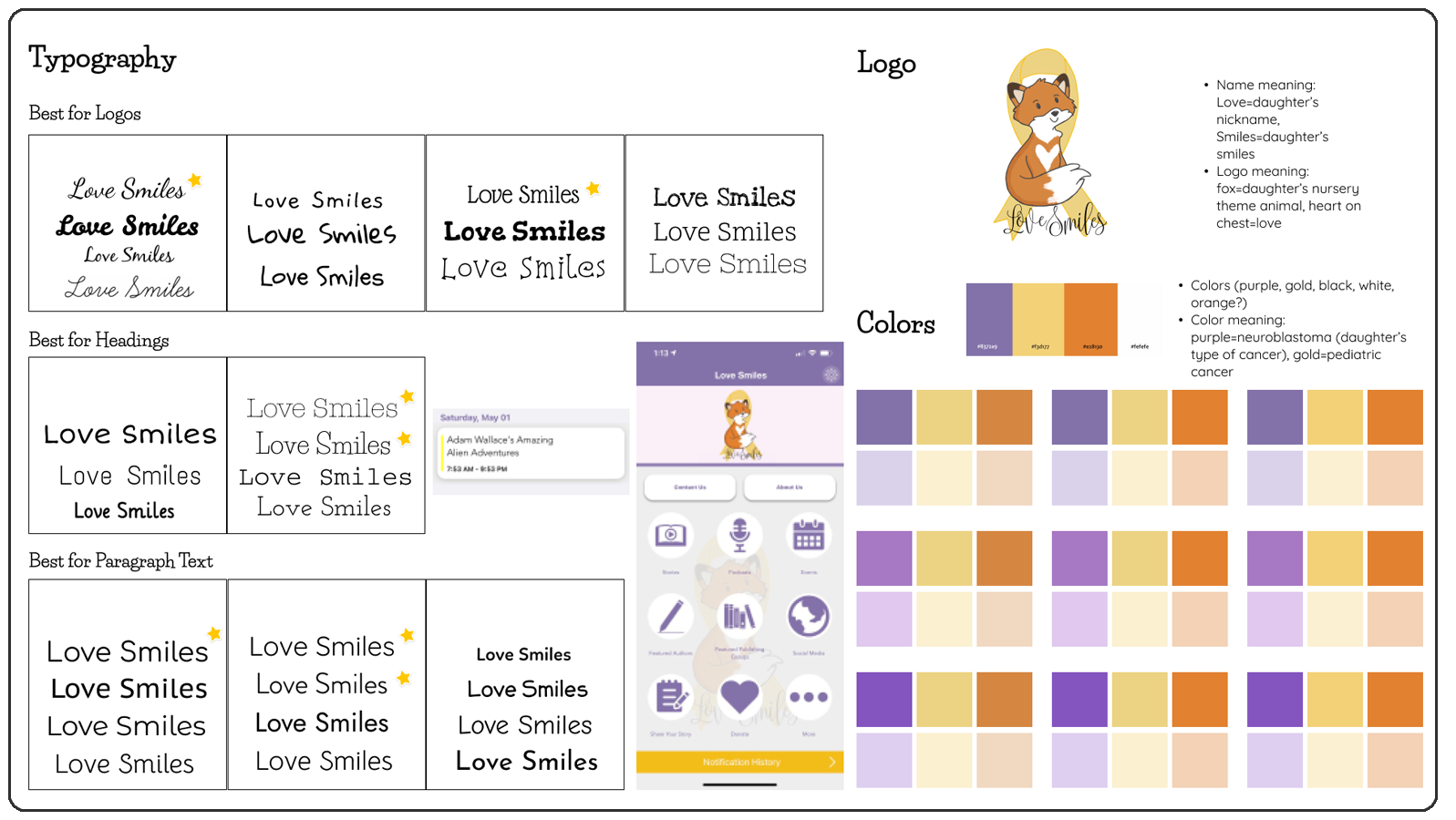
We wanted to include the founder in the design process due to the organizations personal connection to her own experiences. Taking inspiration from her existing logo and app we created the following preliminary style guide to introduce various fonts and colors that we were considering using and let her have the final say in the exact combination to be used.
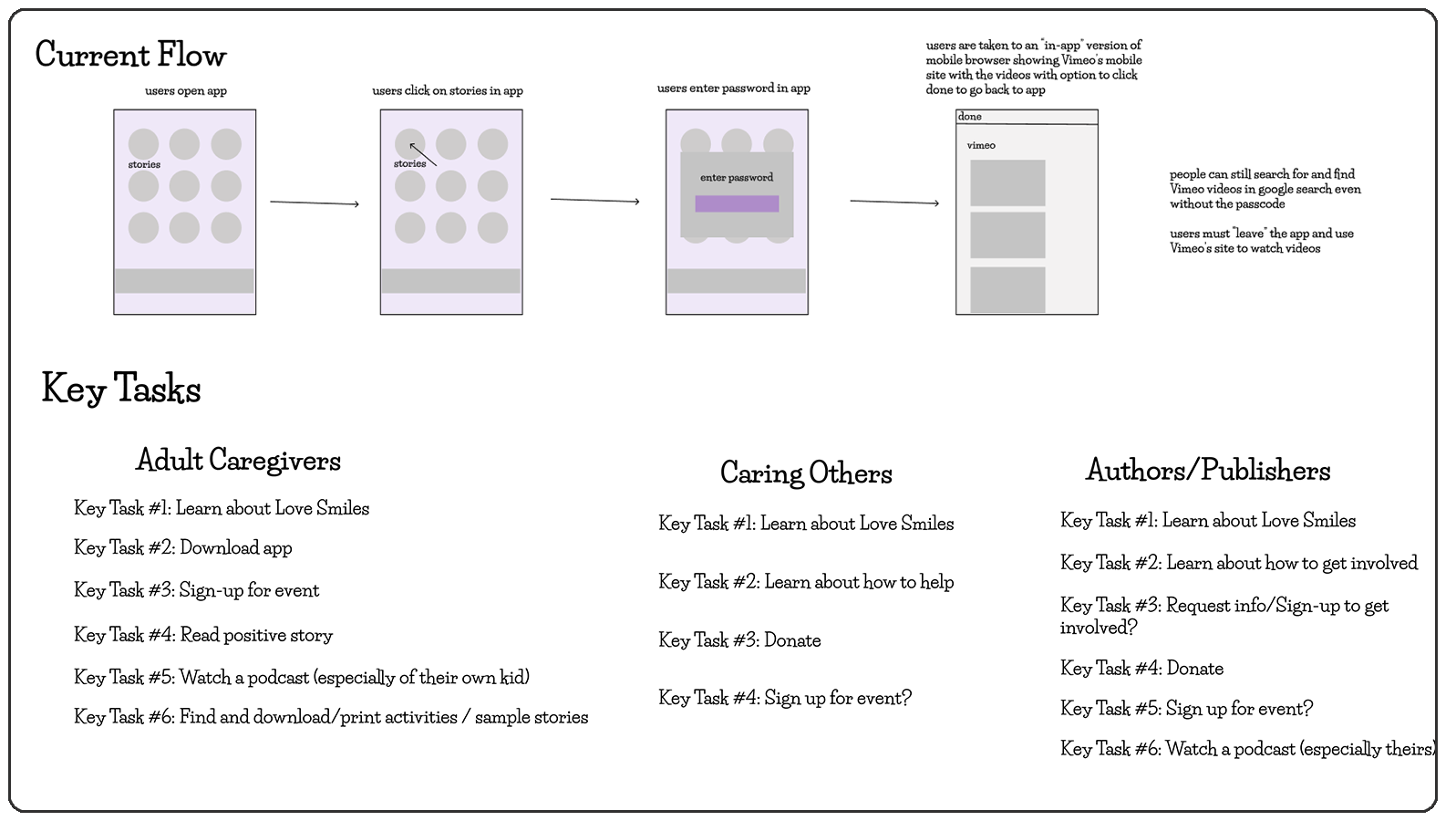
One of the main issues the existing mobile application had was the convoluted menus leading users down multiple page paths to find the content they were looking for. We knew we also had to take care when creating the website due to the wide variety of content that was planned to be available. Before starting on wireframes and the information architecture, we took the time to create some key tasks that we felt were going to encompass major areas of the website which we could then use guide the pages we'd wireframe as well as to test during our user research phase.
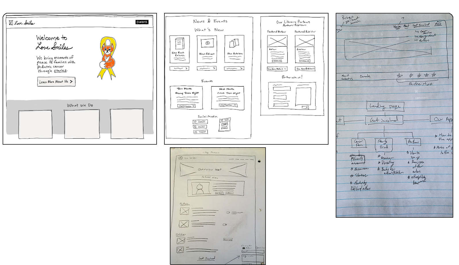
The team started with low-fidelity wireframes to quickly iterate on layout and structure based on the user flows and key tasks we had previously defined. This allowed us to focus on functionality and user experience without getting bogged down in visual details. We discussed what worked, what didn't and what we wanted to pick out from our ideas to work further on in the next phase. We focused not only on what the functionality would be, but also how they fit within the greater theming and representation of the brand.
We had one main goal with our first round of user research at this point in time: Information Architecture & Clear Terminology.
Because we had a large amount of potential content we had to take into account when creating the website we knew that the most important thing to keep in mind was
making sure content was where it was expected to be and that getting there felt natural.
Thus we started by recruiting 26 participants for a tree test aimed to iron out any
issues we potentially had with the structure of the website, the terminology we were using, and make sure users understood where various content was housed.
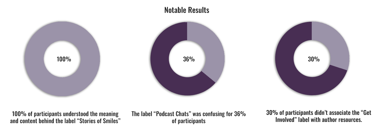
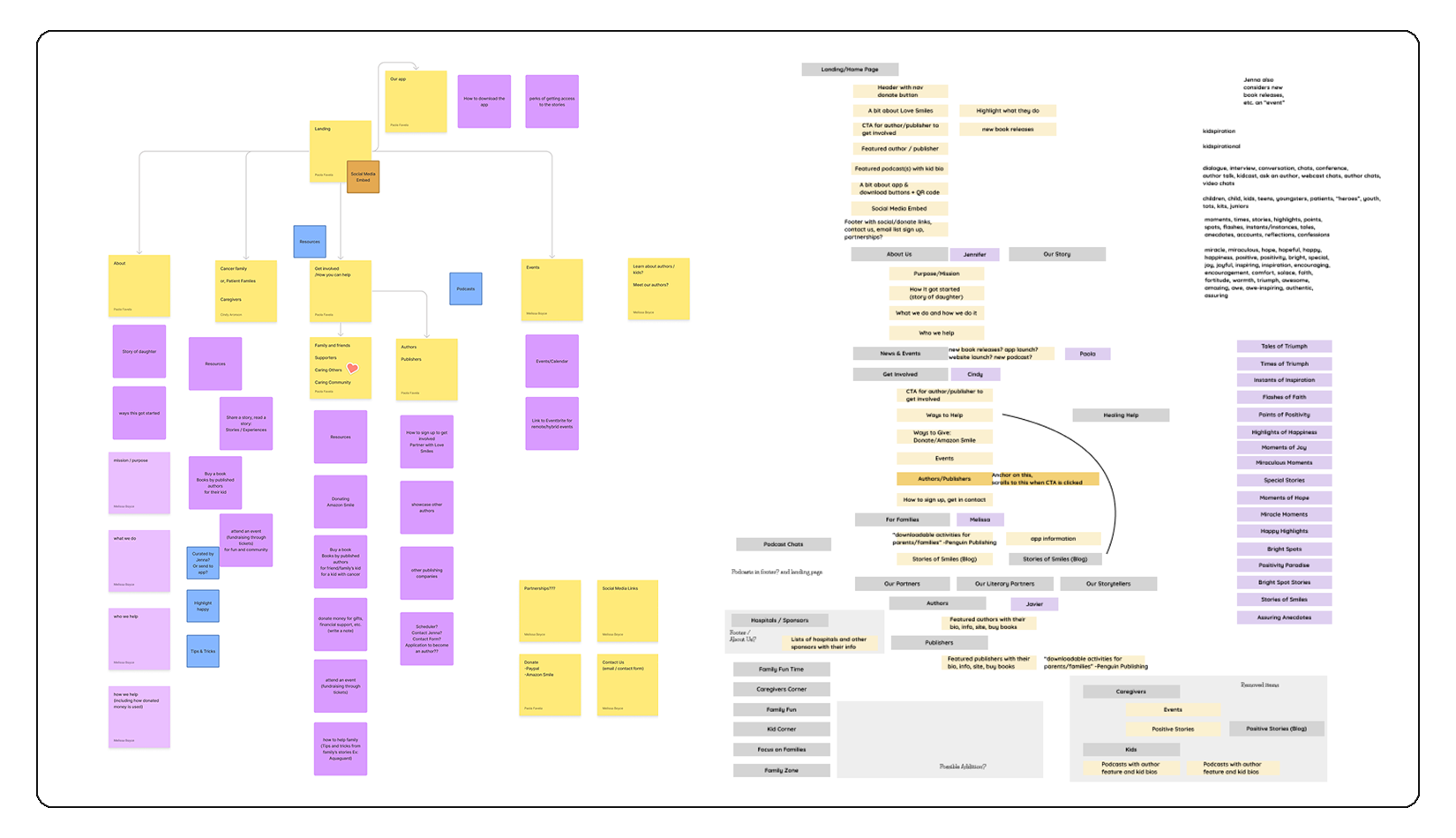
After this initial round of user testing we decided to reevaluate our information architecture and the terminology we used across the website. While the founder was keen to certain words and flowery language our testing clearly showed that this type of language was not beneficial to the website's navigation. The image below shows the revised information architecture framework we used for our second iteration of the website which we then used this second iteration for our second round of user testing and interviews.
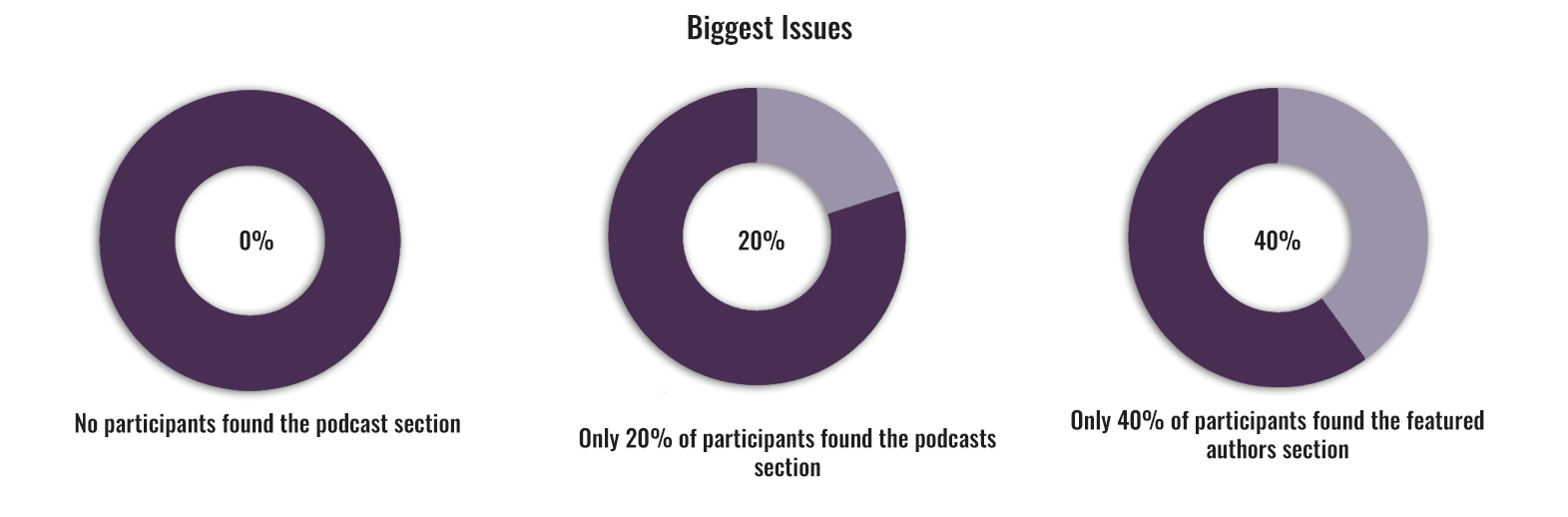
For our second round of user testing we recruited we recruited families of pediatric cancer patients, friends of families, and authors to better represent the range of groups who were expected to use the website. These participants took part in both a short interview to gather general impressions and opinions on the website's visuals as well as a task analysis involving 8 tasks which asked users to navigate to different sections of the website so that we could get a grasp on the revised information architecture and terminology. Collection of this data was followed by an affinity diagram to better understand the themes of issues that had arisen throughout the testing. While some of the issues we saw previously had seemingly been resolved, a couple new issued, as seen below, arose which we had to take care of going forward.
With all the information in place, we set out to remedy as many issues users had as possible using the data from our research as a guideline. However, as our time frame was limited from the start, we chose to prioritize working on high-impact, research-backed issues.
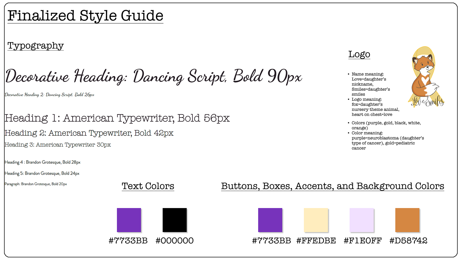
First, we created the following finalized style guide which ensured that anyone working on the website in the future could keep the same visual style.
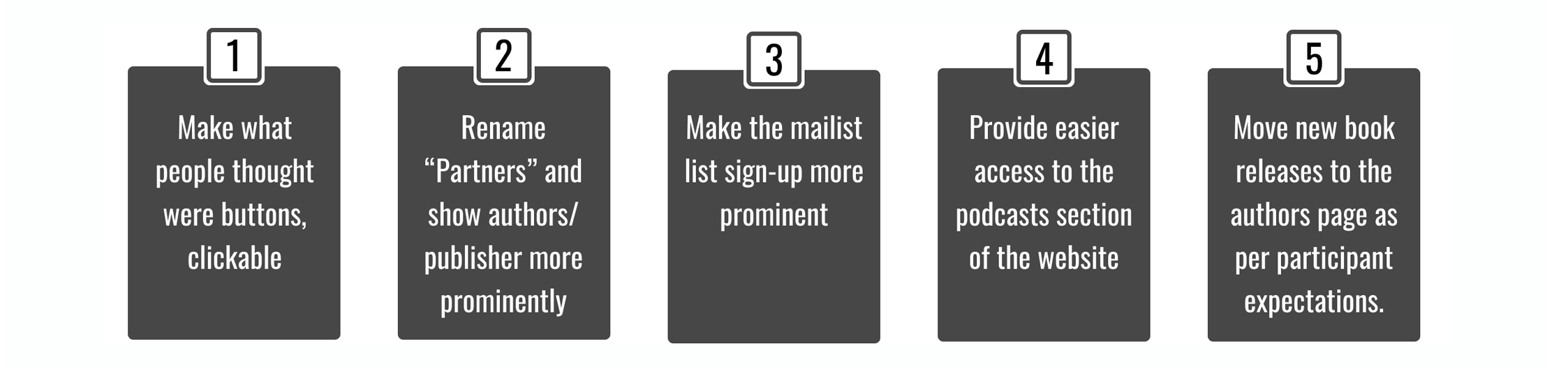
Additionally, we worked on the terminology used throughout the website by settling for less verbose language and instead using terms more commonly seen on other websites. Apart from following our revised information architecture
to get improve on the terminology, we also narrowed down the issues we observed issues into five we considered the most important . These five suggested changes, seen below, were based on our previously
research and aimed to make section of the website easier to find and interact with.
Finally, we decided to cut out sections of the website which didn't have content ready, such as the podcasts, in hopes that less content overall would equate to users have an easier time navigating the website and less chances of
them stumbling upon empty pages.
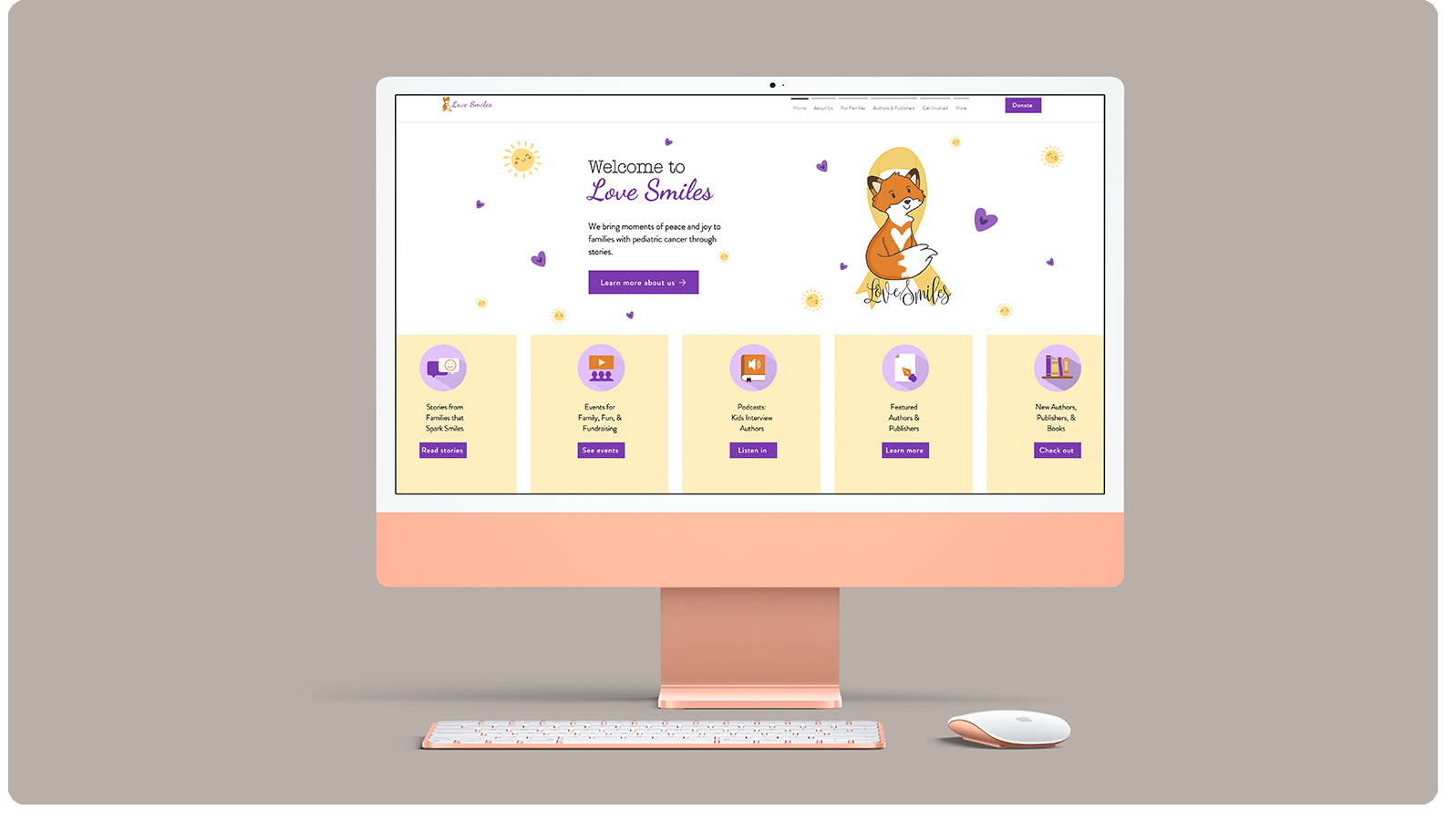
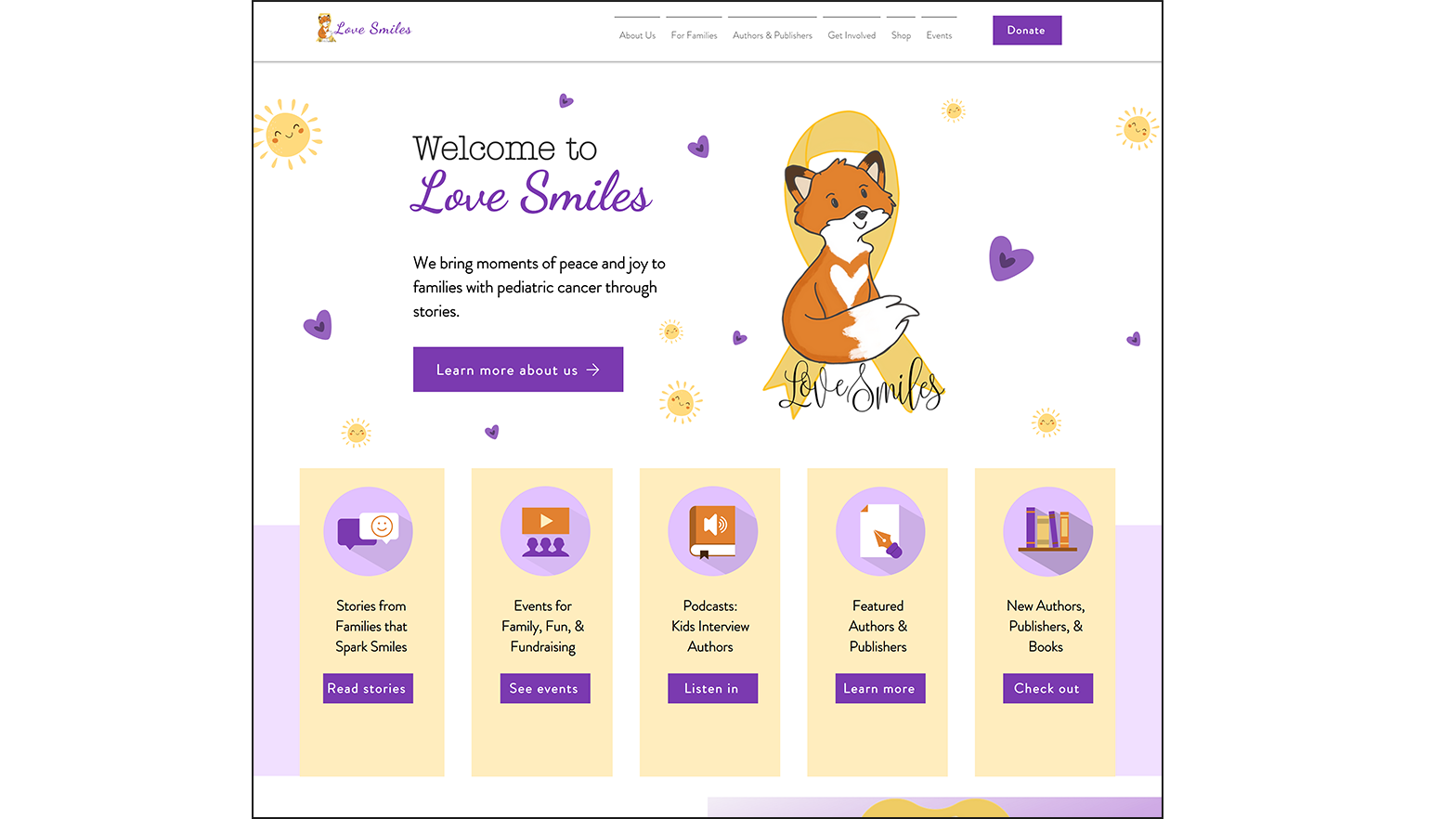
Below is an image of the finalized Love Smiles Homepage. During our second round of testing, participants were observed attempting to click on the yellow banners, which were purely decorative at the time and did not have accompanying buttons linking them to their respective sections. Participants were having trouble finding these sections as we initially intended. A simple solution was, instead of reworking the navigation once again, to instead follow the path of least resistance and let users click on these banners that they thought were clickable. If users are trying to use an unintended, non-working path, just make that a new path work as they expect.
After successfully launching the website, which the founder and her board members loved, we decided to finish the project by giving them a list of future recommendations that aligned not only with their own aspirations of growth, but also provided a direction for anyone they employed to work on the website in the future.
The first recommendation from the list specifically resulted from the research we did that pointed towards users wanting to be informed about new content or events. We thus came to the conclusion that for users not following the Love Smiles social media platforms, these notifications would be the "reminders" to keep users steadily returning and hopefully taking part in Love Smiles' events. The caveat being that because the website was new and quickly growing, giving users the ability to set the frequency of these notifications would be helpful as to not inundate them with every single update.
I was contacted by the founder of Love Smiles around a month after our initial project to come back and continue working with them and the website. I agreed to return and work on whatever they need, which first meant cleaning up
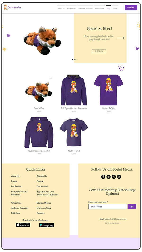
some minor issues that resulted from our original limited time-frame such as some SEO problems, dead links, and organization of downloadable partner materials. However, the major work I've done for them has been a redesign of the authors page which
resulted in many more profiles being able to included on a single page in an organized manner as well as the creation and implementation of an online store for Love Smiles to sell merchandise and gift packages that can be
donated to children in hospitals. Examples of both pages can be seen below.
Additionally, I Expanded the partners page through close collaboration with Love Smiles board members and publisher partners,
including Penguin Random House, to deliver strong partner visibility without compromising the overall user experience.