2023-2024
Alignimals
A casual animal-themed match-3 puzzle experience
2023-2024
A casual animal-themed match-3 puzzle experience
This project began after identifying a gap in mobile games, particularly the absence of classic zoo-style management experiences commonly found on PC. To address this, I conceptualized "Alignimals," a mobile game that combines match-3 puzzle mechanics with zoo management elements, combining a classic mobile game genre with an underexplored theme.
Initial Interviews played a large role in the understanding of the project's goals and direction.
These interviews provided the project with player habits, feature preferences and expectations,
initial opinions on the project, and an understanding of what Alignimals would be competing with.
To start the project, 16 participants were gathered and screened, moving forward only with those
who had played mobile games within the last month, and interviews were done to better understand
the playing habits of mobile gamers. Some additional questions were also asked in order to gauge
interest in the style of game the project was aiming to create as well as to understand what features
players might expect and prefer in such a game. Participants were asked the following questions, some
open ended and others multiple choice where appropriate:
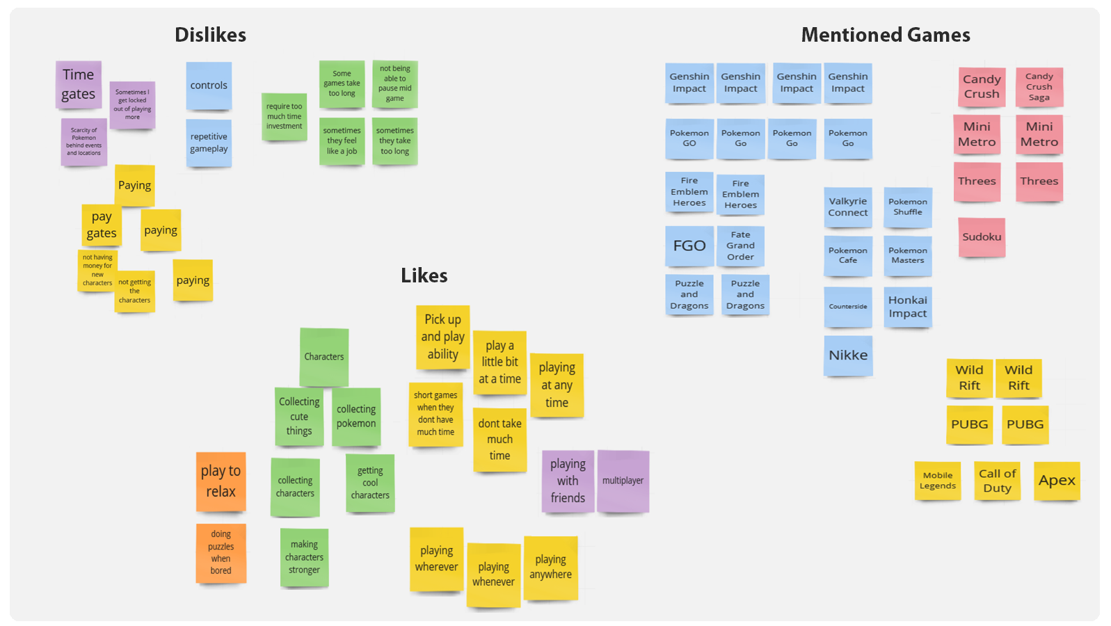
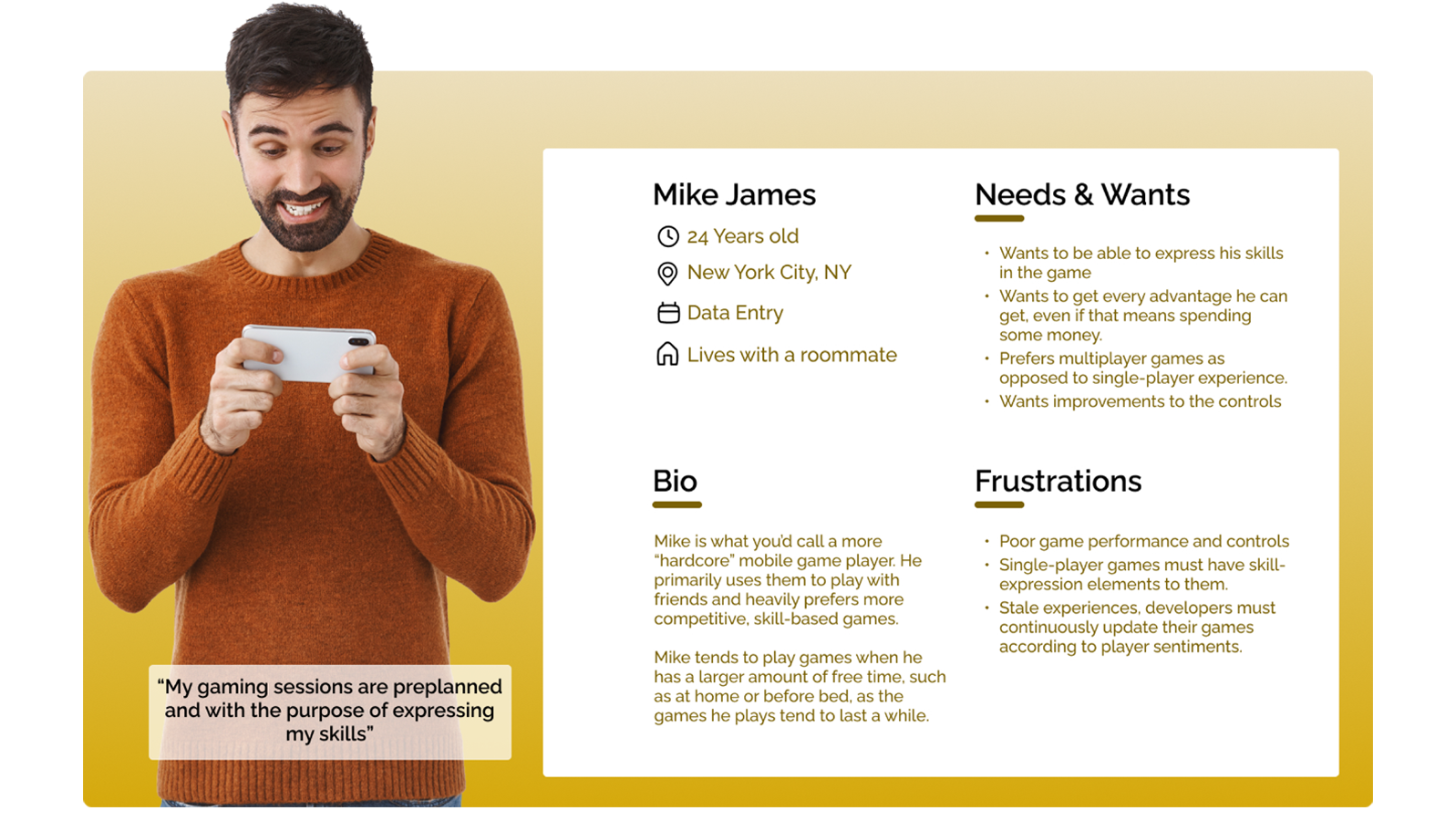
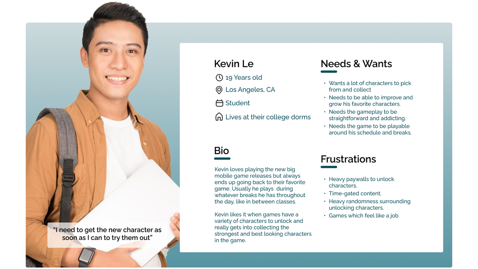
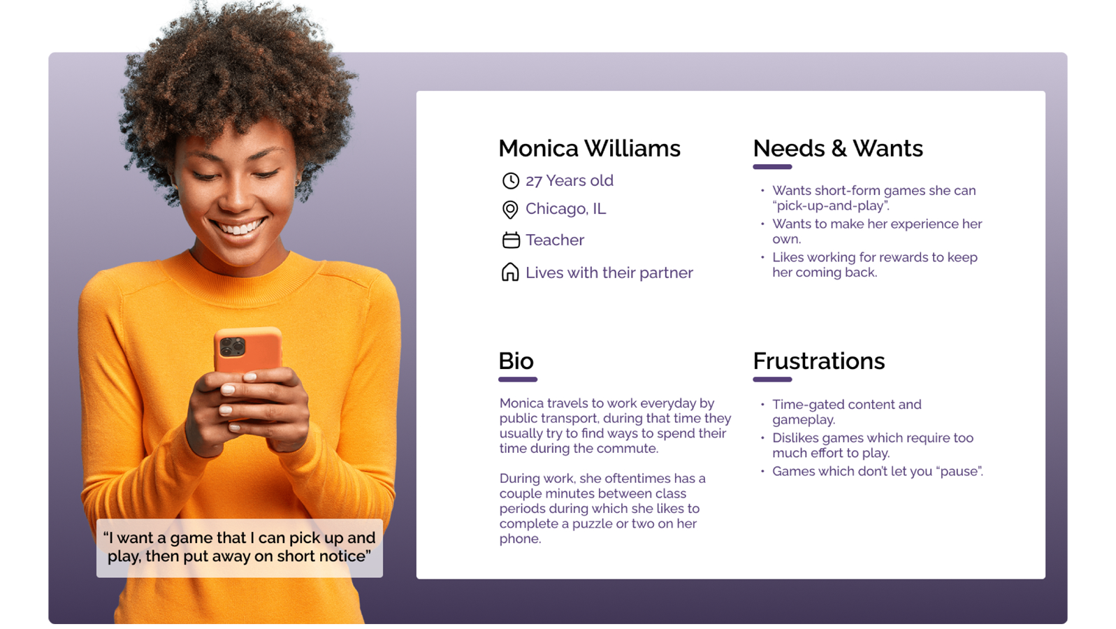
The initial interviews gave the project a good starting point into understanding the users that might interact without Alignimals. Three personas, representing three distinct types of users, were thus created, influenced by the affinity diagram in order to better cement and personify the different types of users, their use cases, issues, and desires. The three categories of users I ended up on were: casual players, dedicated collectors, and competitive players.
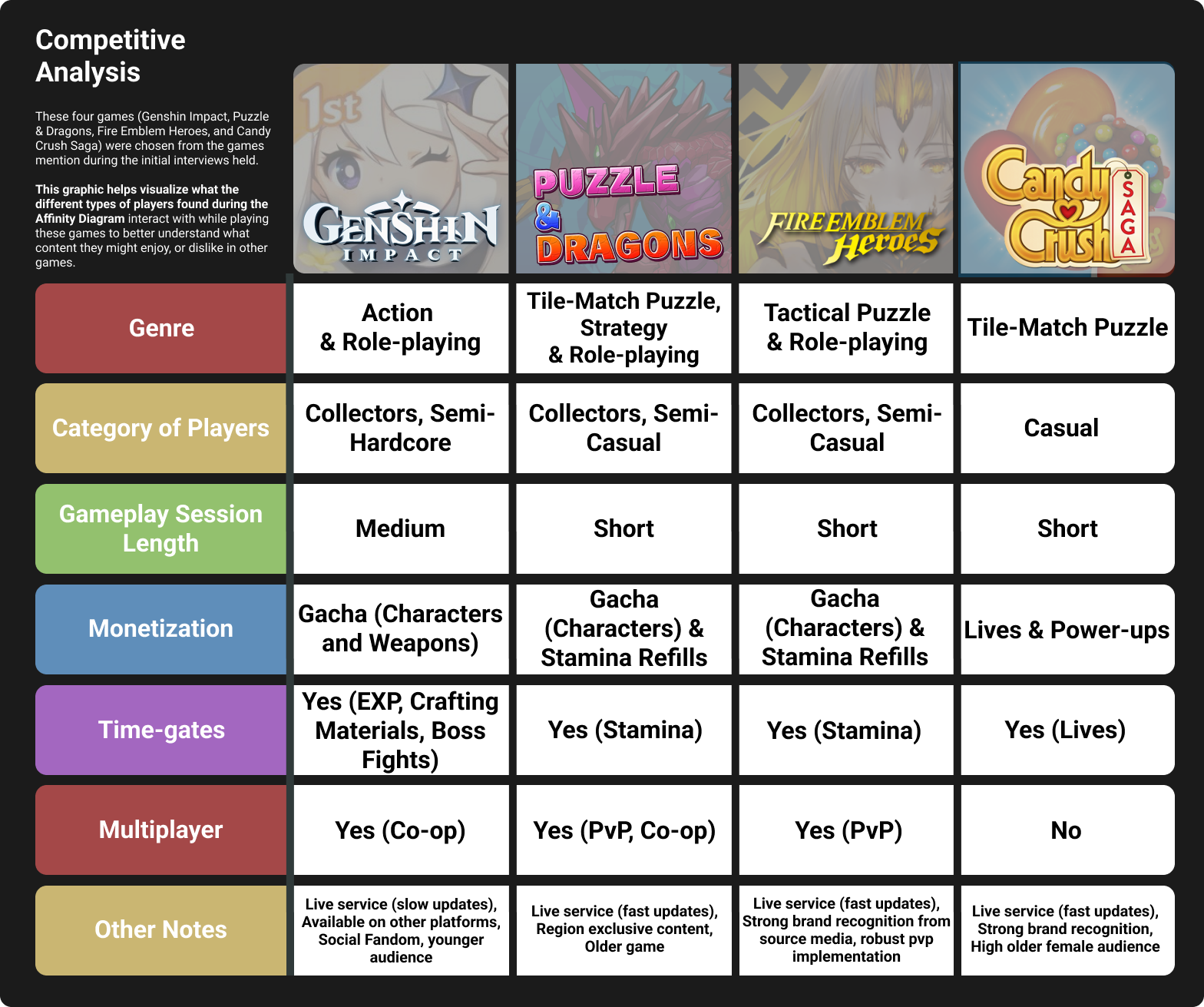
A competitive analysis was also done in order to gain a better understanding of the games that the participants in the initial interview mentioned by name. Doing this allowed even further visualization of the information observed during the affinity diagram. The chart allowed an at-a-glance understanding of the types of content the interview participants interacted with in other similar games. This information acted as a great starting point for the type of content Alignimals might want to incorporate into its experience, in essence, taking the best parts of other popular games.
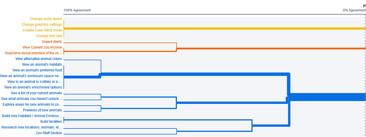
A remote open card sort was conducted with 16 initial participants using OptimalWorkshop. The goal of this card sort was to start collecting information for the creation of the initial information architecture as well as better understand the potential terminology I could use for menus and buttons. Users were given cards describing various features of the game decided through the competitive analysis and initial interviews. Below is a dendrogram created using the information collected from this card sort displaying the best merge methods for the content which was planned to be included.
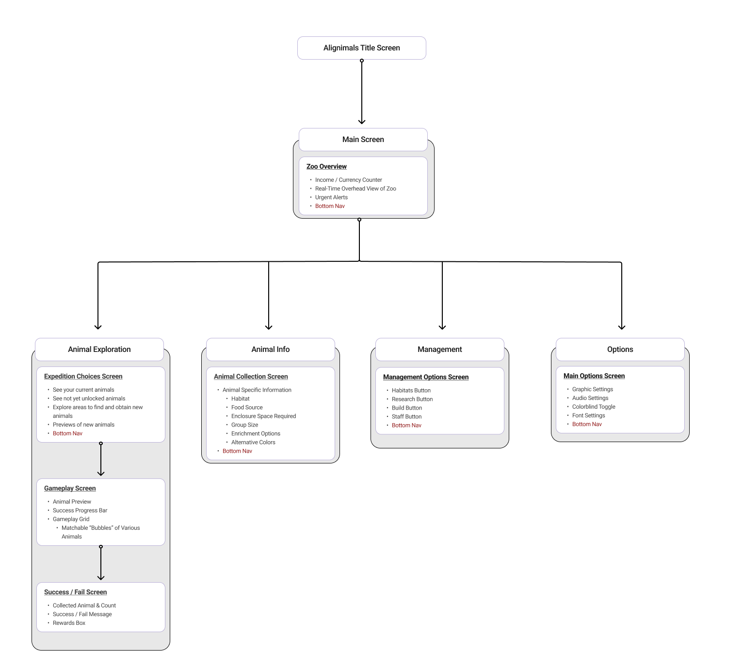
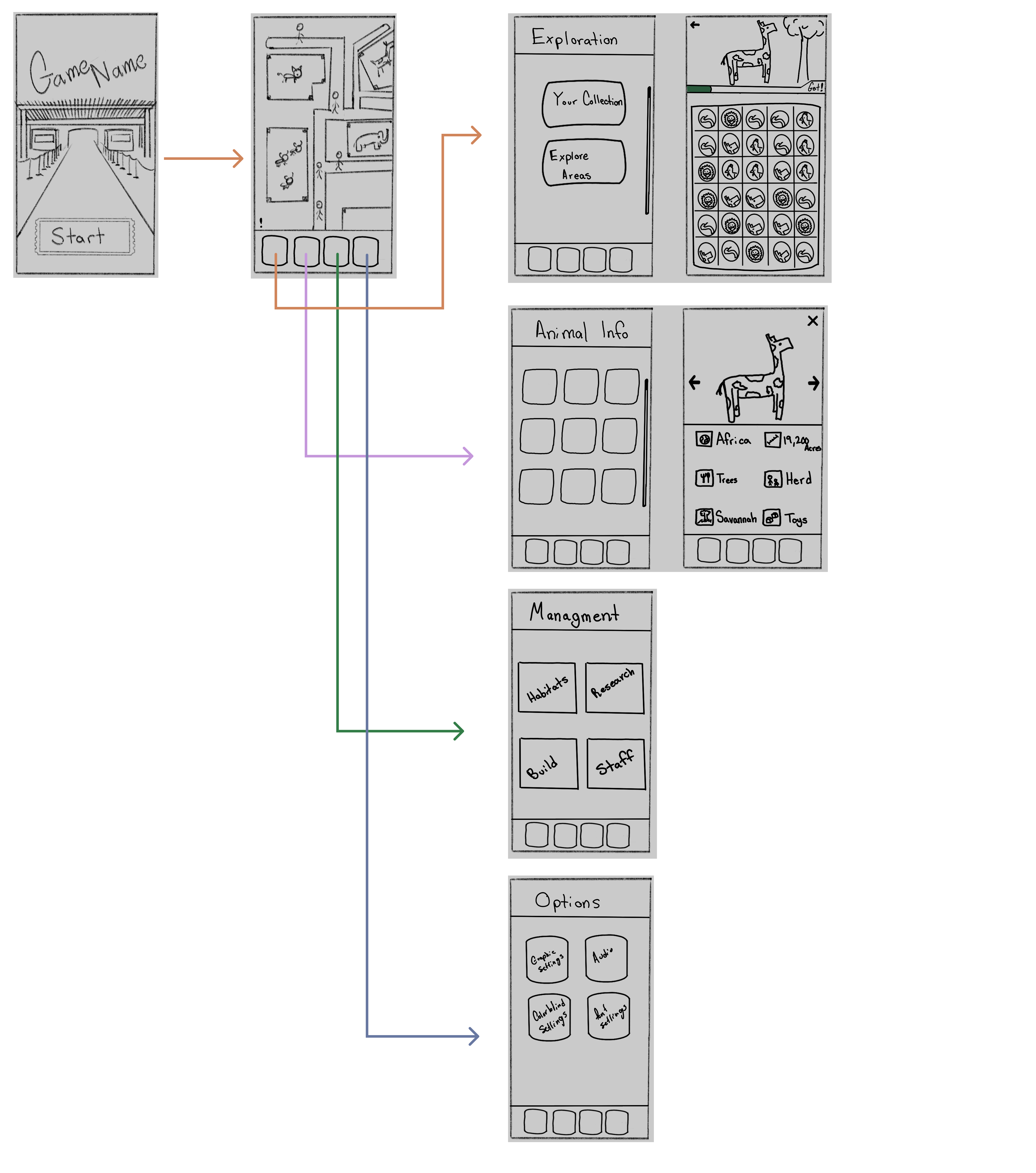
With the information on what content users expected, where they expected it, and what content they tended to group together, an initial information architecture could now be created to plan out the structure of the app, the connections within it, and titles for screens. This initial work was made with the understanding that it was not final, not perfect, and expected to be iterated on. However, the benefits of this work came to fruition during the created of the initial wireframes and for the tree test as it allowed for a solid foundational structure to test upon.
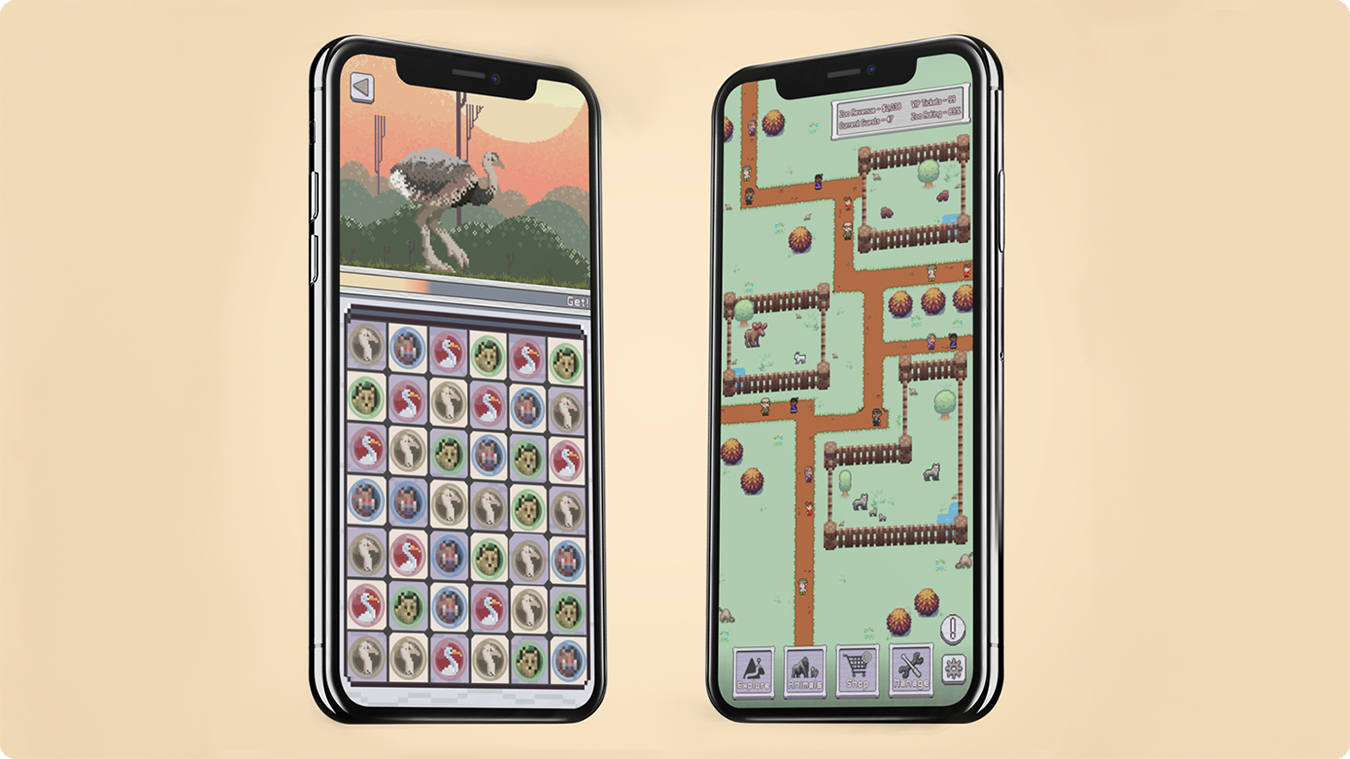
Using all the information collected thus far, from the interviews, to the information architecture molded by the card sort, initial low-fidelity wireframes were created through multiple iterations to visualize the initial design and navigation thus far. The image below was the low-fidelity wireframes that were ended on, they kept the structure simple and the navigation seemed easiest for users to move through. Inspiration was taken from various other mobile games mentioned in the initial interviews, most notably the UI organization and placement.
As an initial step in iterating on the wireframes, a tree test was conducted to evaluate and improve the site’s navigation and information architecture. The test revealed confusion around where certain content was expected to be located. While participants were largely successful in navigating to gameplay and the staff hiring sections (90% and 100% success rates, respectively), they struggled to locate “Your Collection.” Seventy percent of participants failed to find this section, and the remaining 30% arrived only indirectly. Notably, no participant’s first click led to the correct “Exploration” page under “Your Collection”, highlighting a key navigation issue (Figures 1–3).
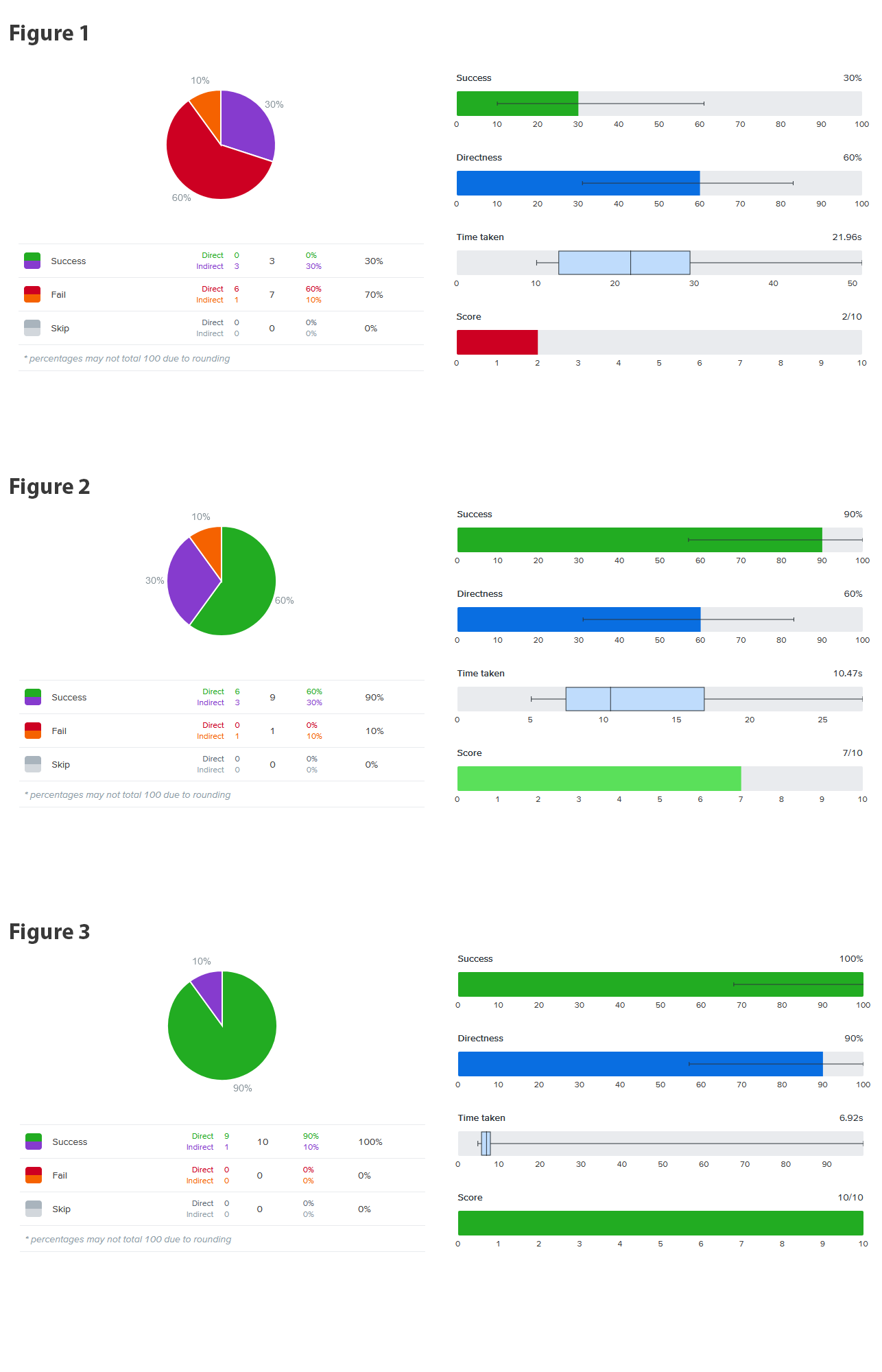
AAs a result of these findings, the collection section was moved into the “Animal Info” page in the reworked information architecture and the Exploration section was remade to only house the path towards the game play. This decision allowed us to line up our navigation with user expectations which would prevent any confusion or incorrect actions when navigating to important, commonly used features of the game.
Prior tree test results showed that 90% of participants successfully navigated to the gameplay section, with 60% arriving directly, reinforcing the clarity and efficiency of this user flow, which requires only two clicks after the initial exploration choice. For the remaining 10% who took an incorrect path, the interface provides clear opportunities to recover, allowing users to return to the home page from any section with a single click. Additionally, since 30% of participants did not reach the goal directly and risked becoming lost, navigation options were refined to reduce confusion. The home page buttons were renamed from “Animal Exploration” and “Animal Info” to “Exploration” and “Animals,” preserving the original intent while creating clearer distinctions to support more accurate user choices.
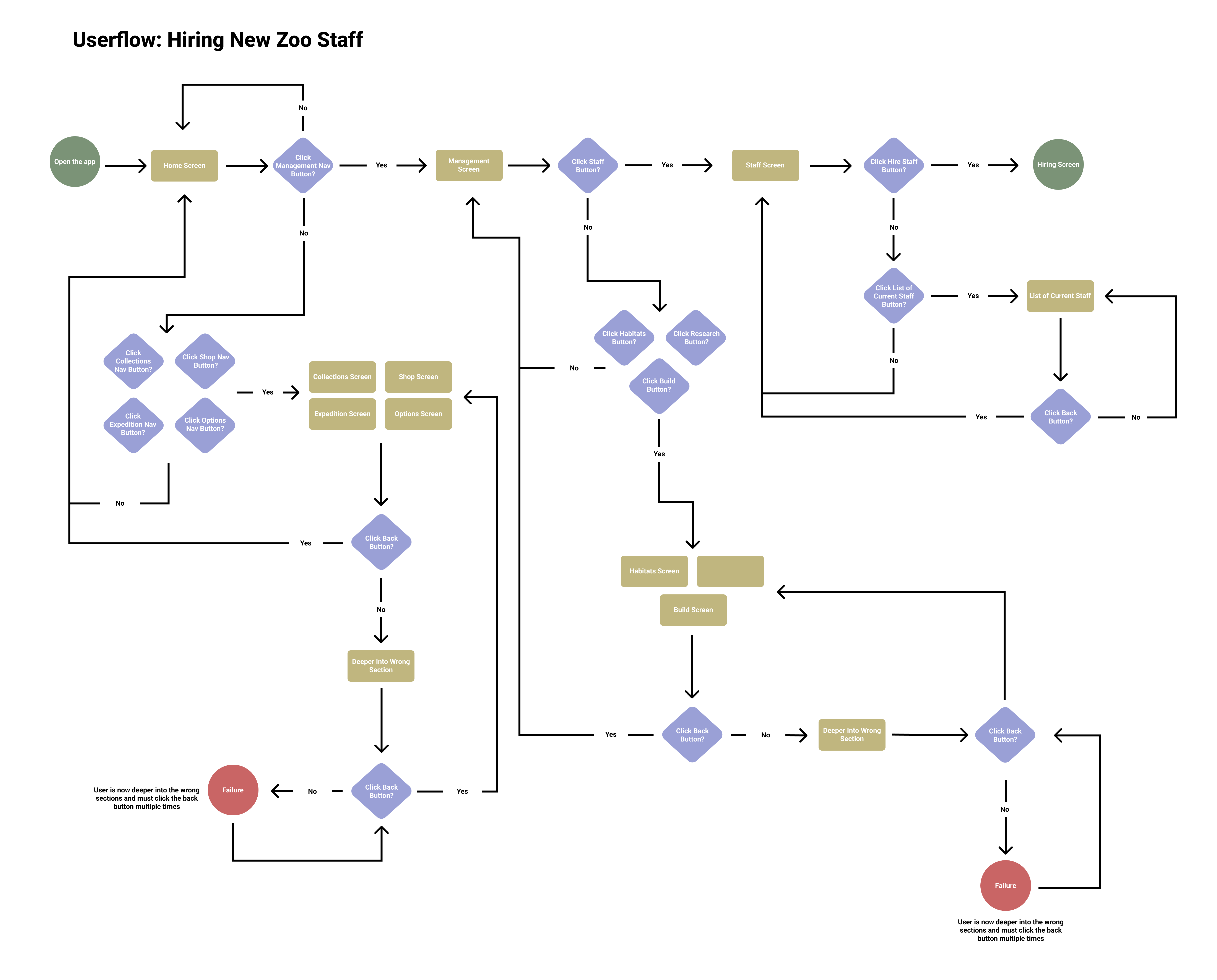
This user flow was more complex than the previous one, as it required users to navigate deeper into the application. In ideal conditions, users could reach the hiring screen in two to three clicks; however, the increased depth introduced more screens and opportunities for misnavigation. To address this, the design emphasized clear recovery options and minimized navigation layers, reducing the need to repeatedly use the back button. Despite the added complexity, participants achieved a 100% success rate in reaching the hiring section, with only 10% arriving indirectly. As a result, the “Management” label was retained, as there was no evidence that changing it would improve navigation or reduce errors.
One final important thing to note is how the “Failure” conditions end up being relatively deep into both user flows because of how many opportunities users are given to return towards the correct path.
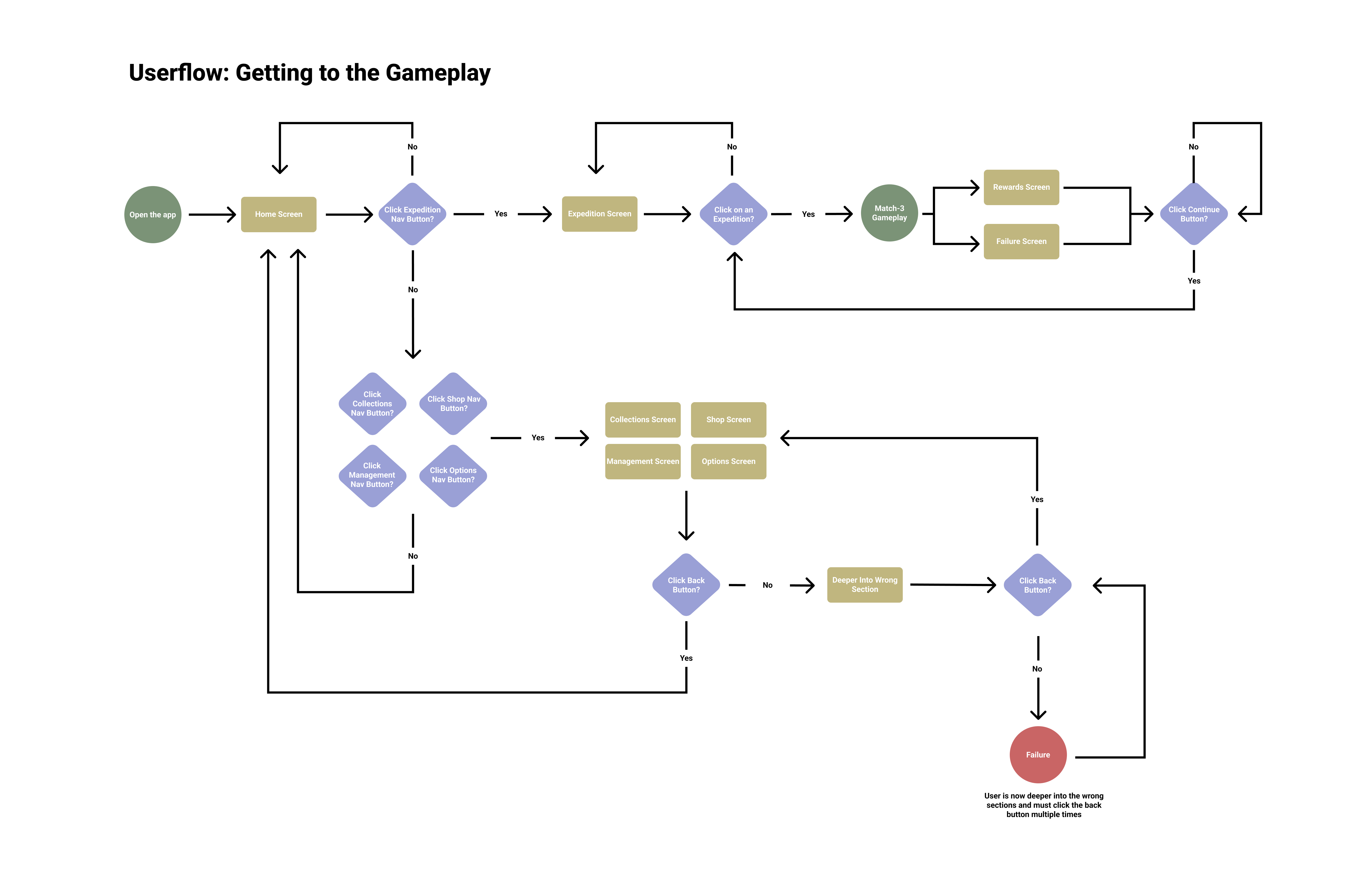
The revised information architecture integrated insights from the card sort and tree test, along with smaller refinements such as simplifying section names (e.g., renaming “Animal Exploration” to “Exploration”). The diagram was also expanded to better represent deeper navigation levels and their associated features. Additional updates included introducing a Shop section and integrating the “Your Collection” area into the “Animal Info” section. In the diagram, blue highlights indicate interactions that lead to deeper pages, while red highlights represent actions that return users to previous sections, either via a back button or task completion.
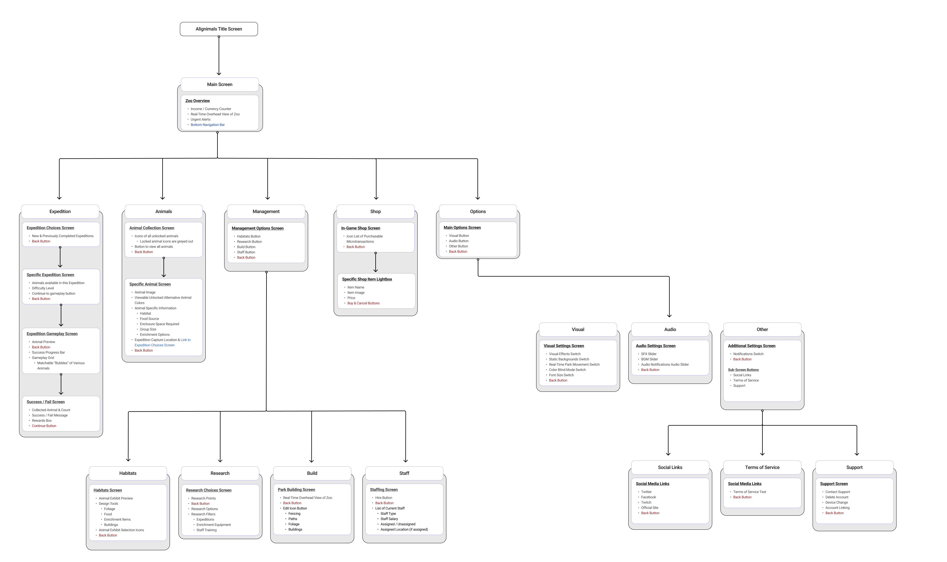
As mentioned in previous sections, various changes were made and areas expanded upon or moved which has led to the need for reworking the navigation UI to reflect the new direction taken since the initial wireframes. For example, instead of the four buttons on the main screen present in the initial wireframes, now the UI has an additional smaller “Options” button and the larger fourth button is now used to lead to the shop which was not present in the initial wireframes. Additionally the reworked wireframes now include pages deeper in the navigation which would now assist in the creation of an initial prototype.
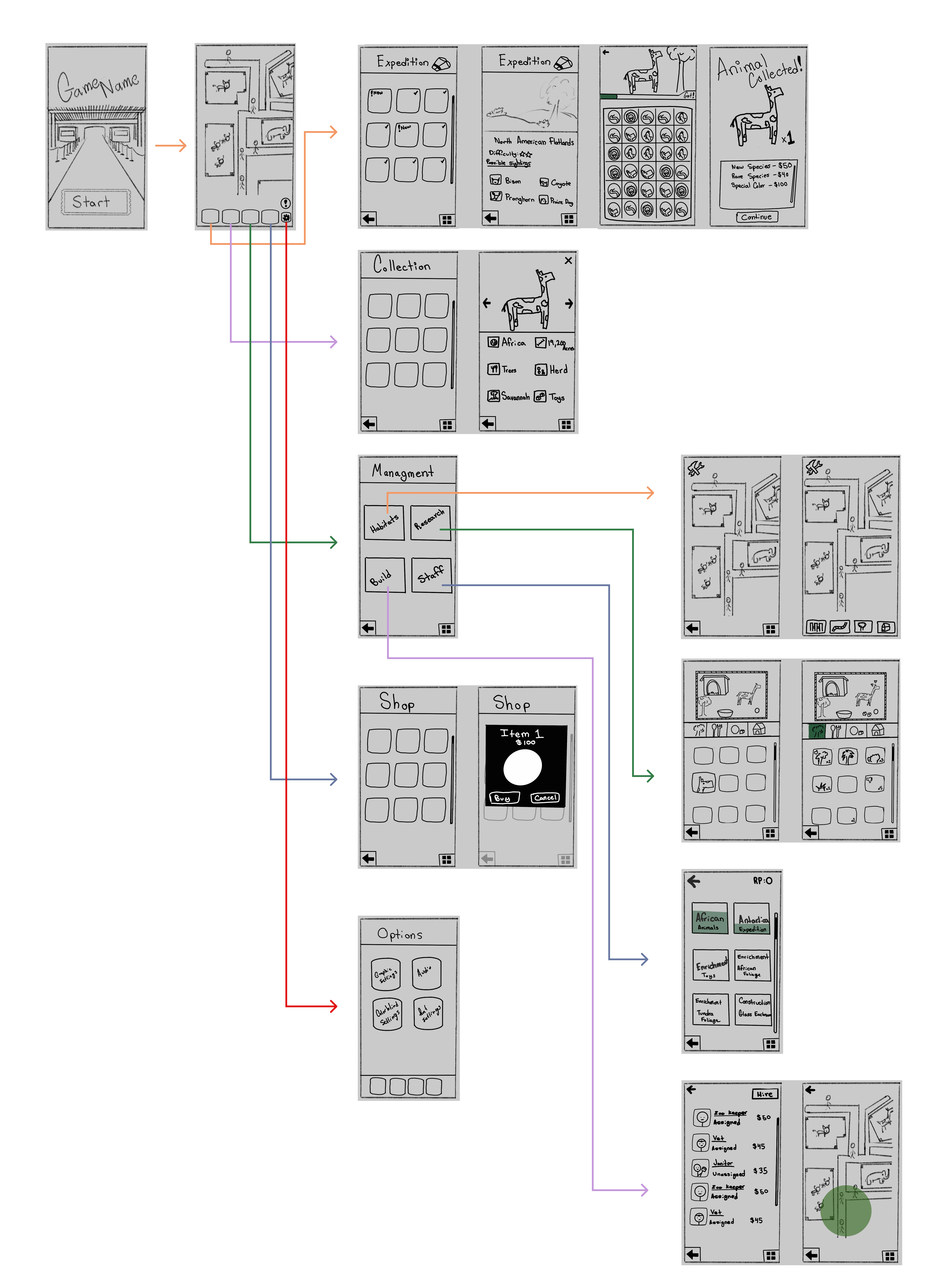
Building on the revised wireframes and updated information architecture, an initial prototype was created to visualize the refined navigation and screen flow. This prototype combines the structural framework established in the wireframes with early visual elements from the emerging design system. Presented in video format, it demonstrates how users would move through key paths within the application, helping to validate layout decisions, navigation changes, and overall flow before moving into higher-fidelity design and implementation.
To support consistency and scalability, a foundational design system was established for the project. This system defines the core visual language, including color palette, typography, and key UI elements such as frames, borders, containers, and icons. The design system serves as a reference for the current prototype and provides a flexible framework that can be expanded on, ensuring visual cohesion across future features and screens.
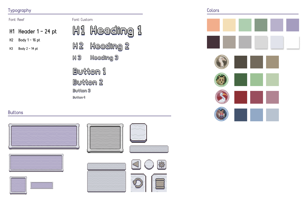
Clear text hierarchy principles were applied throughout the project to support accessibility and readability. Headings are consistently the most prominent text on each screen, while primary informational content is sized larger than supporting descriptor text (14px). This hierarchy improves legibility and scannability, making content sections easy to distinguish through a combination of text sizing, borders, and background treatments.
Text sizing is consistent between similar use cases. Screen Headings are the largest with a near 60px size (Exact sizing is not available due to the custom font used), section headings on pages are then the second largest size (near 46px), the last consistent text size used was for miscellaneous text (14px). This 14px text was used for every piece of text apart from the headings, section headings, and button text. Those buttons have a variety of text sizing according to the button size, thus aren't consistent in size. They range from 14px to around 30px.
Initial evaluation revealed that several elements did not meet WCAG AA contrast guidelines, with white text on slightly dark backgrounds sometimes reaching ratios as low as 2.5:1. To address this, backgrounds were darkened and smaller text received dark outlines, increasing contrast ratios to at least 4.5:1 and ensuring WCAG AA compliance.
The prototype includes subtle motion, such as the gentle bouncing of animal sprites, but contains no flashing or blinking elements, minimizing any risk of photosensitivity or seizures. While the risk is low, a settings option allows users to disable all cosmetic motion, including idle animal animations, for added accessibility.
To accommodate users with color vision deficiencies, the prototype avoids relying on color to convey critical information. Buttons are clearly labeled and consistently styled, ensuring they remain identifiable without color. Similarly, interactive elements in the gameplay screen, such as bubbles, use unique visual markers, like distinct animal icons, so they can be distinguished regardless of color perception.
As with any type of work one does, there is a lot I'm unhappy about, and a lot I believe I was blinded about during the design process. For starters I will say that I'm content with the research done for this project, a lot of my gripes rest not on that, but on the design side of the work.
If given enough time and resources I would have used different visual elements for this project. However, given the time I had as well as not being a pixel artist, I was limited to what I could find for free from various talented artists. As a result, I believe the prototype does not have a 100% cohesive look to it precisely because it's a hodgepodge of work from various artists including myself.
Expanding on that previous point, I didn't like how a lot of the buttons and framings turned out. This was one aspect I believe I was blinded about during the design process. I believe I was too invested in keeping a cohesive “pixel” theme and I ended up settling for subpar work in some sections just because I thought they fit thematically at the time. If I was to work on this project further I would first attempt to collect more outside opinions then potentially rework some of the navigation UI visuals.
Keeping up with what I'd do if I continued working on the project, usability testing would be what I pursued next using the prototype. Tasks would ideally partially focus on aspects of the project that were part of previous research, such as the navigation, making sure the changes made using the previous data were successful. Another task would ideally ask participants to go through the zoo building process, testing the other important mechanic of the game.
Finally, as to not be so somber, I was content with the information architecture and overall user experience in regards to navigation. Thankfully because of this, I believe that even if I went back and reworked some of the UI as I mentioned, as a whole it wouldn't take too much time as the underlying work is something I feel is sound.